|
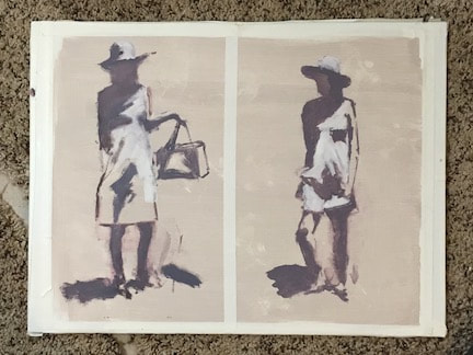
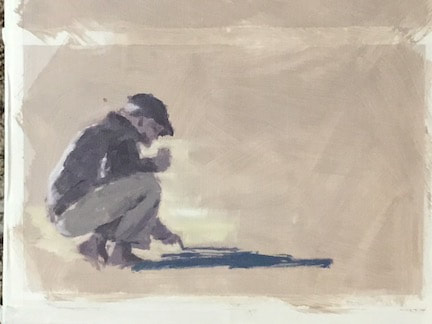
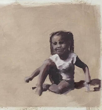
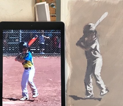
Have you ever noticed how you can see a shape from a distance and know exactly who or what it is? Even when most of the shape is in shadow, our beautiful minds interpret form and attach meaning to it from our reservoir of knowledge and experience. Recently I was privileged to attend a fantastic workshop with a focus on shape and a goal of capturing the gesture of that shape by limiting and controlling the values. In drawing and painting, the term value refers to the relative light and darkness of the color/hue of an object. if you look at a sphere with the light source coming from one angle, you'll see a gradation of shading on the unlit side. The same goes for just about every single object; it is that combination of light and shadow that gives it form. It doesn't matter what color is used as long as the correct value of the color is in the proper placement. Then our eyes and mind will know what we are seeing. Most inanimate objects do not typically express gesture. A chair, a rock, a shoe all have shape and volume, but are rarely affected by motion. The word animate, either a verb or adjective, is derived from Latin "give breath to, enliven, endow with spirit" and that is what we set out to learn to capture in our paintings during this class. Marjorie Hicks, our very talented, kind, and generous instructor (check out her website HERE) presented us with several photographs of her models in various model-y poses and demonstrated her process of painting in three values of warm gray hues. My painting of the two poses above shows how we start with a mid-value toned canvas. Once I got the drawing lines in, all I had to do was fill in the deepest shadow side with the darkest of my 3 values and then pop in the lightest value where the figure is sunlit. Easy-peasy! (sort of) With another figure (photo provided by Marjorie) taken one step further, I added just a couple areas of color, making sure the value was the same as my tonal lay-in. It's a little hard to see here, but the man's cast shadow is a blue hue and there is a slightly lighter mid-tone value of yellow on the sand around his legs. I could continue to add color to his shirt, hat, etc, being very careful to keep the color value the same as the tonal value. That can be difficult because our eyes tend to trick us with color values. This was so much fun to paint in this way that, for the next few days, I used my own photo references to practice what I learned. One side benefit is that it has really helped me with my drawing practice and given me hope that I can grow in that skill, too. Thank you for reading my blog! And don't miss the new group of paintings in my fabulous Art Sale!! See them HERE!!
0 Comments
Leave a Reply. |
Hello! My name is Wendy and I am passionate about oil painting! Whether in the studio or out in Mother Nature, I get lost in the experience of capturing on canvas the moment and the feel of what I am painting. I pour my love and energy into every single piece of artwork and I hope it shows! This blog is a place where I can use words to talk about art, painting, life, faith, things that make me laugh, and things that inspire. I love every response, so don't be shy about leaving a comment...Archives
June 2024
Categories |

