|
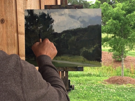
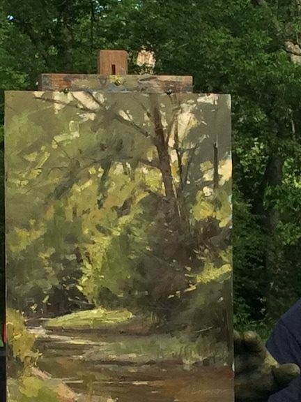
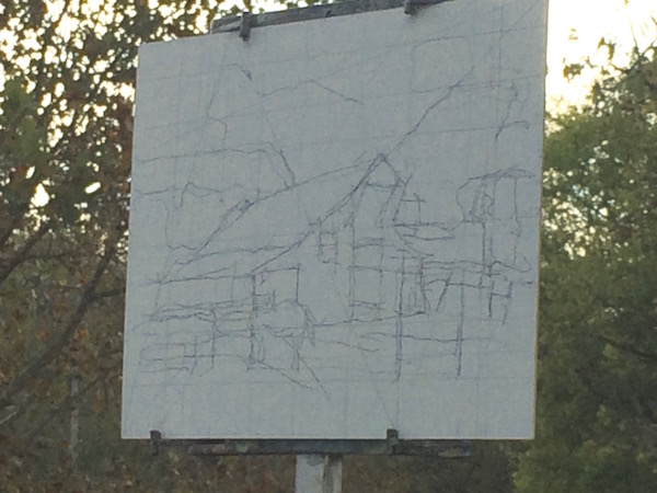
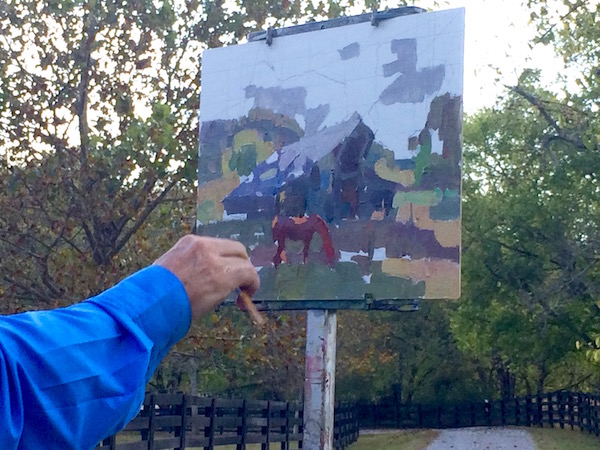
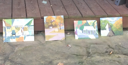
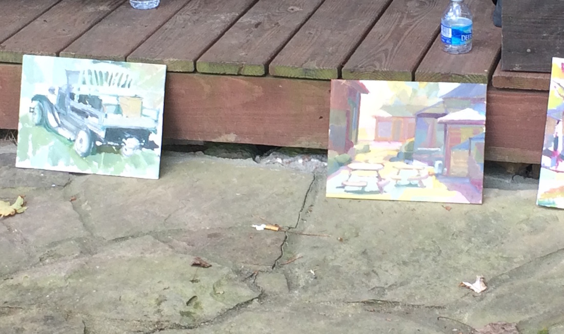
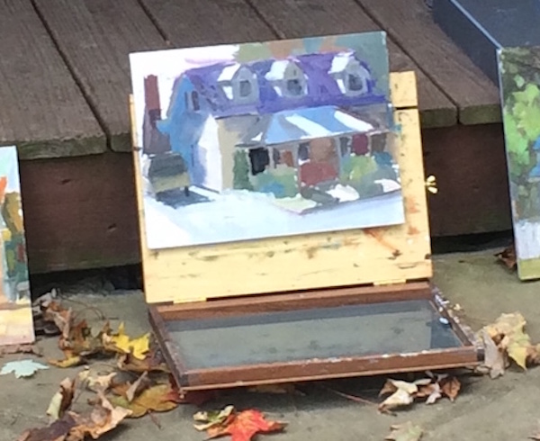
One thing about Tennessee weather is that it changes frequently...like every 5 minutes. Day 3 we were promised thunderstorms but it began instead with sunshine and big puffy clouds. Very pretty. Our painting location was moved back to OnTrack Studio because the forecast created the need for indoor painting possibilities. Today's subject was Concept; why am I painting this? What draws me into this scene? What am I trying to say, to capture? Marc's assignment to us was to go find something we wanted to paint and choose a few words to describe what the big idea is. He discussed the difference between illustration vs. emotion in a painting. Illustration will give the viewer the hard facts, the lines, the colors. To be successful as an artist/painter, we must want to evoke emotion in the viewer and this will take time and experience. I wonder if I can apply this to the problems I encountered yesterday with the unsatisfying creek painting. I knew how I was responding emotionally to the peaceful flowing water but can see that I need more experience to be able to intuit values and colors to communicate the loveliness. Today I was determined! So, what caught my eye was the enchanting simplicity of the red-roofed shed with baskets hanging off the eaves (and the shed behind it with the red wagon repeating the roof color), all nestled against the explosion of cool green trees. (I guess that's more than a few words to express the Big Idea) I set up my kit on the lawn (out in the open) and painted hard, with one eye glancing upward as the sky did its changeable thing. Uh oh, thunder in the distance. My setup was only 20 feet or so from the covered deck; I had time. A few minutes more painting...I really was forced to concentrate: where are the shadows, how saggy should I make the roofline? how dark do I go in the back shed? Yikes! That is a very dark cloud heading this direction! What did Marc say about intuition? Mine was telling me it was time to move to shelter. Two minutes after everything was safely relocated, the heavens opened (and not with angels!) This is my quick 2 hour painting: 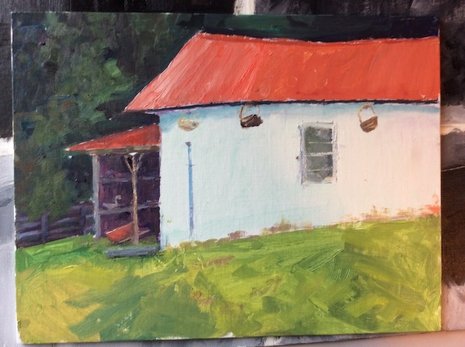 The storm brought a sudden drop in temperature and the day went from low 80s to low 60s. Some of us got kinda chilly. We gathered for a final demo by Marc and a critique session of the work we each had accomplished, which sounds scary but wasn't. Marc helped us learn from each others successes and challenges. We were able to ask questions and encourage one another, and we finished with a sense of community and camaraderie. Much appreciation to Marc Hanson for giving us such a fantastic workshop!
2 Comments
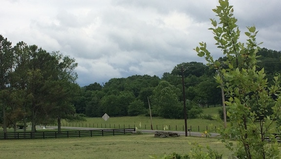
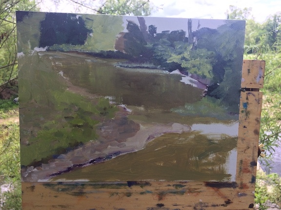
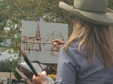
Tuesday morning we gather on the porch of Leiper's Fork Gallery and then make our way a mile or two down the road to a beautiful ranch, familiar to many of us from previous workshops and paint-outs. Because it's Spring in Tennessee, we spent several minutes spraying ourselves silly with various versions of anti-tick & chigger sprays. You cannot be too careful! Marc Hanson, again, started us out by sharing his vast knowledge, this time covering the topic of color, which is no small subject matter. You can tell when someone has truly wrestled with and mastered an issue; they speak with what could be described as grace. Big words and flashy accessories are not required...Marc plunged through a wealth of information about the primary colors and their characteristics, the warm and cool versions of each, the subjectiveness of color temperature, the need for both knowledge and intuition with color decisions. For me, the big take-away was to learn to mix colors intelligently. This requires that I observe how much red or blue or yellow is in the local color of the scene I am painting, the intuition of how warm or cool that color may need to be, the knowledge of which version of the primaries to choose to reach that desired color. We were then turned loose to find the scene that was speaking to each of us. This was the one I chose: 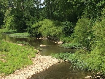 Isn't it pretty? Tennessee basically comes in one color in the spring. If you guessed "green" you would be correct! And green just happens to be one of the most challenging, not only to mix, but to render it in such a way that is actually pleasing in a painting is super difficult. I knew that going into my painting, but still happily had naive hopes that I could work it out. What did happen was sort of a murky green mess, but, as you mindful readers know, it is our mistakes that teach us the most! Lucky for me, Marc chose the same part of the creek to paint his demo. Now I could see how a master handles all that yellowish green. Thank you for reading my blog!!
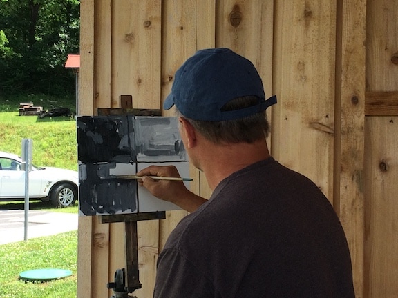
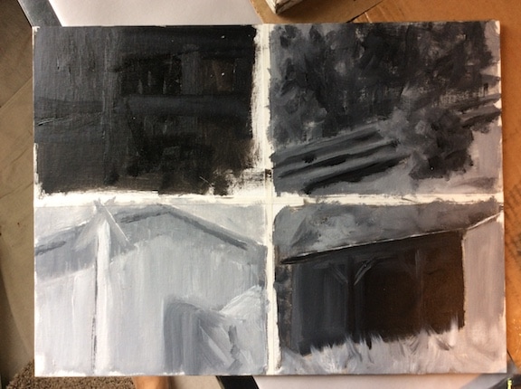
A beautiful Spring day, perfect for a painting workshop! We began the day...well, after the torturous drive through Nashville rush hour traffic to get to OnTrack Studio in Franklin...on the covered porch with Marc Hanson talking with all of us about his favorite supplies and discoveries. He generously shared his thoughts about brushes, supports, and miscellaneous tidbits (such as: Utrecht brand titanium white stays more fluid than other brands in cold weather.) He embraces a humble attitude when it comes to the tools of painting, having found that $4 brushes (Simply Simmons) work just as well as the high end brushes for much of the lay-in of a painting and a sun-shield from Walmart is handy for shading a canvas. He stores his many palette knives in the $3 plastic brush holder from Hobby Lobby. Gotta love the practicality! His demonstration painting took us right to the heart of the day's lesson...to get the composition and values correct at the start. #colorgetsalltheglorybutvaluedoesallthework Dividing a large canvas into 4 sections, he painted one light-valued scene, one middle-value scene, one dark-value scene, and one final scene evenly weighted with all 3 values. When a painting is done with the correct values, it will "read" beautifully even in shades of gray. Here is Marc's demo done in the late afternoon on Day 1: 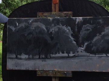 value study demo by Marc Hanson value study demo by Marc Hanson THIS IS NOT MY PAINTING!!
The reason it looks so fabulous is that it is the work of a Master... who was teaching all of us passionate students how to create something beautiful. Tomorrow (Day 2) we will be allowed to play with color. That will be in the next blog post. Thanks for reading!! 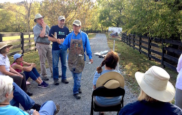 The previous blog post was about Kevin helping us understand the ins and outs of value (light & dark). Moving on to "shapes"...Kevin Macpherson pretty much exploded our brains as he presented the importance of abstraction in representational painting. His explanation is that irregular, unexpected patterns are pleasing to the human brain, so I found this on the internet: A leading proponent of this theory is V.S. Ramachandran, director of the Center for Brain and Cognition at UC-San Diego and author of The Tell-Tale Brain: A Neuroscientist’s Quest for What Makes Us Human. Ramachandran outlined 10 aesthetic principles that interest or delight the neurons in our visual cortex. One of them, peak shift, describes the way “we find deliberate distortions of a stimulus even more exciting than the stimulus itself.” And this: In an article on peak shift in Psychology Today, Jonah Lehrer describes a study in which subjects could more readily identify famous figures like Richard Nixon by cartoon caricatures than by photographs. The part of the brain recruited for facial recognition, called the fusiform gyrus, excels at interpreting the qualities that distinguish one object from another, to the point where it favors slightly warped representations of reality. Anything to make our paintings more pleasing to the viewer! So Kevin demonstrated some of the ways to keep abstraction within the picture plane:
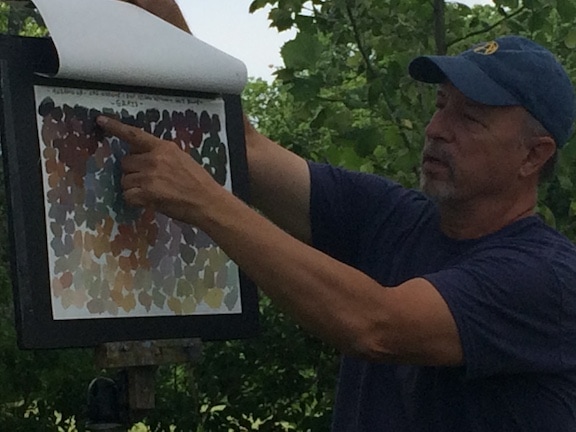
Kevin used a clever technique of dividing the canvas into completely random geometric shapes and lines and encouraged us to use those as we compose our subject matter to paint. This is a bit hard to explain in a blog so you will have to take one of his workshops sometime! I highly recommend it! (click on photos to read captions) 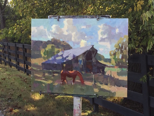 Kevin's finished demo: single darkest dark, consistent values in shadow areas, clean colors, loose abstract shapes  Kevin Macpherson reviewing and critiquing our day's work The few days post-workshop are a lot like jet lag! It's crazy how tired my brain gets and the silly little squabbles my left brain has with my right brain. Art is funny in that way because you really do have to use both the analytical, decision making brain AND the nonverbal, intuitive brain to create a successful painting. So, here I am attempting with words and symbols to create a picture for you, dear readers, of what Kevin, a tremendously successful and very popular American oil painter, taught us last week. There are three key ingredients that make up a good painting: light & shadow, abstract shapes, and color. Of course, there are about 50 more ingredients that help out, but without these three the results will disappoint. Another word for light & shadow is "value" and the artist uses a value scale of 1-10 to decide how dark or light a particular color mixture is. Squinting is the happy habit of the painter. Try it yourself: take a moment to look at the room you're in, now squint your eyes until what you see is reduced to only dark and light. This is the beginning of a painting composition! It's a very flat plane of abstract light shapes and shadow shapes. Some of the dark that you see are recognizable objects, like a chair or lamp, but you are also seeing the cast shadow and the form shadow of the object which gets included in the overall dark shape. Now it's not a chair. It's an abstract area of dark. If you sketch that shape out on paper and put in the other dark shapes you see in the room, leaving the light areas alone, the result will be a simplified value sketch, a roadmap to follow as you begin your painting. Kevin emphasized how important it is to understand that every color (and there are so many!) in the shadow areas must be painted a darker value than anything that is in the light. Sounds simple, but this is where ms. left brain and ms. right brain wanted to mud wrestle in my head. Not only was SEEING and IDENTIFYING the lightest "shadow" crazy difficult, but REMEMBERING that the lightest color value in the shadow still had to be darker than the darkest color value in the light area. Try saying that to yourself 10 times! We 20 brave students gave our best efforts in the mid-80's autumn sunshine of Tennessee and by our third painting we all passed the bar! 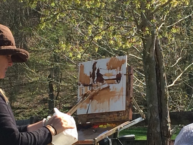 Oh, Over-confidence, you are not our friend. After two solid days of absorbing artistic truth from a Master, I felt so happy and confident to tackle a lovely, bucolic country scene. I think my heart got ahead of my hand and I was quickly brought back down to earth. But, lest you think it depressing, I must tell you about the community of students I was in. Everyone was so great and so eager to learn and grow. There truly were no "ego trips" or critical attitudes. We ranged in experience and skill levels and came from many different areas of the country. We all struggled with our supplies, we all forgot or lost something, we all succeeded and failed and kept soldiering on. It was wonderful! This is my final workshop post...except for the big reveal of my work...and I want to share the "limited stroke exercise" (cue dread and doom music.) Here's how it works: first make an initial drawing of the subject using thinned paint (Anne used burnt sienna.) Get your basic shapes, lines, and relationships in place Step 2: Amp up the values with at least 3 values apparent, light-midtone-dark. Oh and also to leave about an inch of margin on the right side where you can tick off your brush strokes. Step 3: Mix up some colors on the palette with the value range to them. Step 4: ready, set, go! Do the painting in 20 brush strokes. What?? Fortunately, a brush stroke is loosely defined as whatever it takes to get the load of paint off the brush. In other words, you might go back and forth in an area filling it in with paint and count it as one brushstroke. 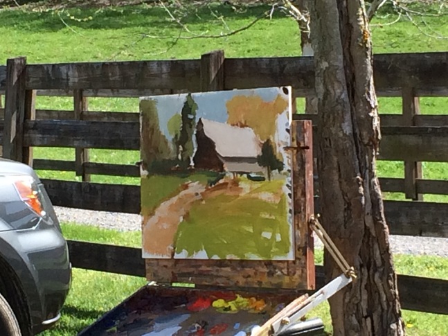 The goal is not a finished painting, but an exercise of seeing, decision-making, and executing. It's an excellent way to do a plein air sketch of a subject to help you evaluate the composition and form interest. On the right margin you can see Anne's marks to log each lift of the brush. I think it was 17 or 18. Squint down on the painting and you can see how she maintained her light, mid, and dark values with the colors she used. Even though there are minimal details, you can still see perspective and identify the subjects.
I intend to put this exercise into practice, but it feels kinda risky to do without supervision. (haha) I also have to overcome that feeling that every painting I do must strive for perfection. It kind of feels like the more I improve, the more I venture into unknown territory. I guess you could say that I am drawing out the workshop blogging as far as possible, since it did take place in April and I do apologize! But it is kind of fun to break it down into small enough chunks so that I can explain the process of learning to "paint what you see." Some of us SEE better than others and over the weekend I began to see that this was an area where I was significantly challenged. Look back at my May 7 blog post and check Anne's initial drawing of the Franklin, TN church. Her lines and perspective are spot on. When I tried to lay in my lines and shapes...well.... It definitely takes practice! In the afternoon of Day 2, Anne sent us into the neighborhood to paint a lovely little scene of quaint houses. Again, I found that my brain was flabby at interpreting what my eyes were seeing. Was the line to the vanishing point angling up or angling down? It was crazy that I couldn't accurately reproduce what I knew I was seeing! Kind of like trying to write with your non dominant hand. 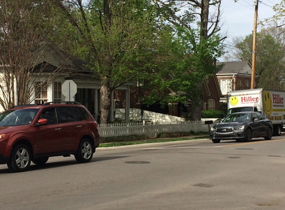 This is the little house I chose to paint (it looked a lot sweeter than the photo shows and then that "Happy Hiller" plumbing truck pulls up and parks? What the....) Wow, did I have struggles with the lines. When the drawing doesn't read correctly to the viewer, well, it's pretty hard to appreciate the painting. In Anne's words, "I see what you're trying to do, but it's all kind of wonky." Once she got me straightened out (with a few quick flicks of her paintbrush) I was able to make some decent progress on the painting. On Day 3, we were back out in the country, this time painting barns. Oh my goodness, again with the wonkyness. Somehow, after staring at and painting that dang barn for at least an hour, I had somehow elongated it all the way to Alabama. Good grief! Clearly my brain and my paintbrush need to get better connected. Anne very kindly and patiently pointed out that it didn't much look like a Tennessee barn all stretched out like I was painting it, then helped me chop off that back third and raise the roofline. Ta da! Back on track. 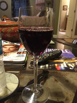 You would think a workshop might be discouraging, but it's so stretching and challenging that I come away exhausted, inspired, a lot more conscious and aware of the intricacies of creating good art. Since the workshop, I think my attention and understanding of lines and shapes and their relationship to each other is definitely on the track of improvement.
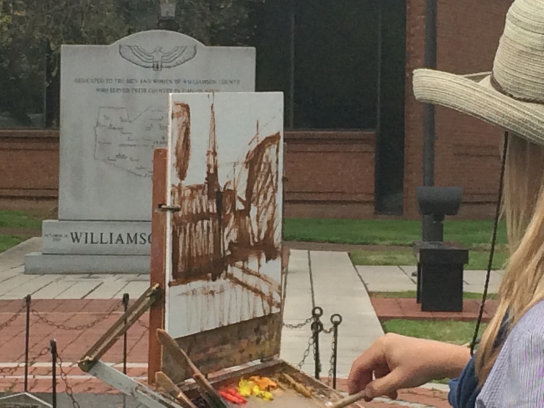
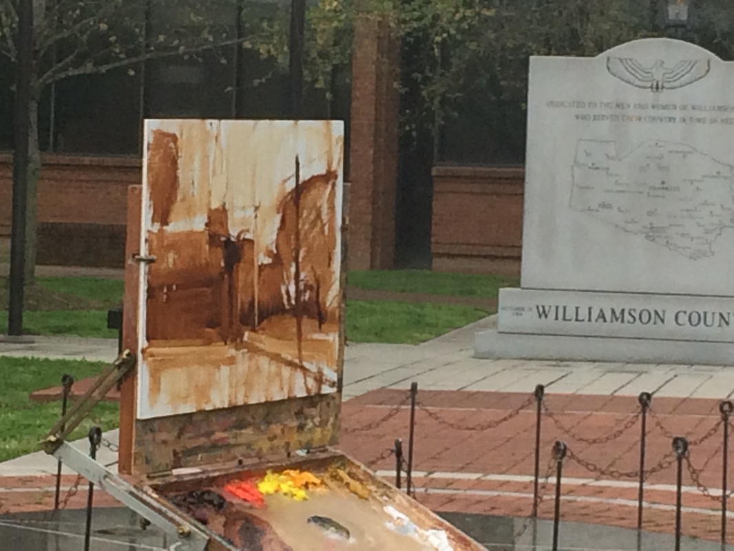
One nugget Anne taught me was to honestly identify my areas of weakness/deficit and make them my top priority for growth. My remedy for a challenging, exhausting, ridiculously fun day of painting?....a lovely glass of wine! We had the best weather for the three day workshop! Even though storms were forecast, Anne and Rachel were somehow able to alter the weather patterns so that every day was sunny and excellent for being outdoors :) Actually, they insisted that they have no control over the weather...regardless, it was wonderful. Day 2: we met at a very public corner in Franklin where several roads converge and by noon there is plenty of foot traffic. No room for shyness in plein air painting! Anne again started with a demo: this time of a lovely, Southern church. The great thing about Anne's demos is that she is instructing through the entire process and doing so in a way that is very understandable.
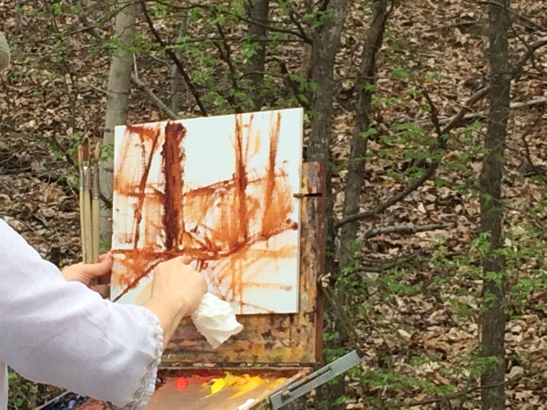
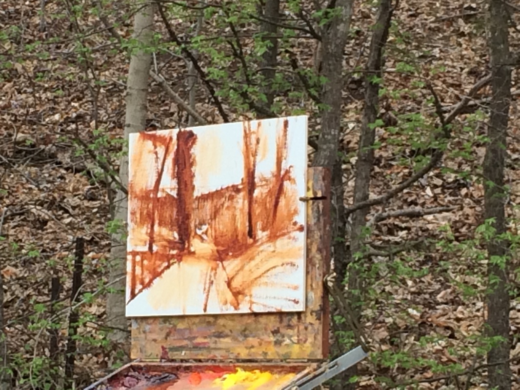
I hope you're not tiring of the redundancy of the process, but here goes!: Anne likes to start with a white canvas (as opposed to a color-toned one), she makes some initial design decisions of where to place the church and locate the lines of sight that lead to it. Do you see the grid lines she's painted onto the canvas? The steeple base hits right on the upper left grid intersection, a great place for the focal point. She continued the drawing, shown in the right photo (my apologies to mobile device users if the photos are not next to each other!) As she "draws" with her brush and diluted burnt sienna, she is looking for the darker areas and getting her lines and perspective in correctly. If she needs to wipe an area that creates some tonal notes to the stark white canvas. Finally it is time to add color. This was a big take-away for me: to take waaaay more time starting my painting, using a tonal lay-in and developing the values in burnt sienna first. You can see that she leaves spots and blops of white canvas peaking through in several areas. I find that to be so interesting in Anne's paintings. I also love the clean colors and the warm, friendly yellows that she mixes. If you look at her palette, you can see the mixes of colors and how they all work together. Of course, she is expert at color mixing! 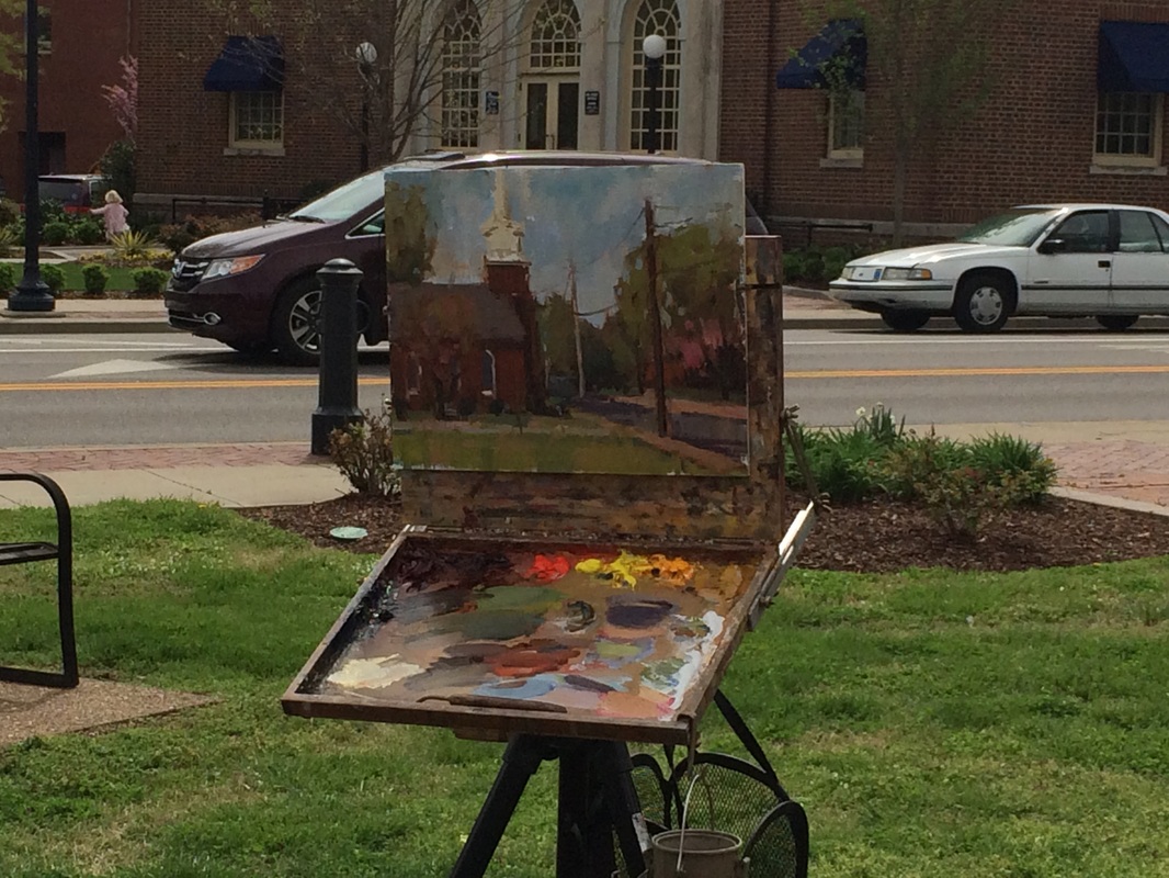 I could say a lot more about the minimal details, the value contrasts, the diagonal lines, the airy sky, the loose brushstrokes, the flowering cherry, the soft trees...oh wait.
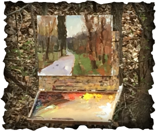
Thanks for reading my blog!! Part one: about good drawing... I have heard from several sources that if a painting goes wrong it's usually in the first few minutes because of decisions, or lack of, by the artist. Drawing is a big one. Learning to place the subject accurately on canvas takes attention, intention and good eye-hand coordination. Anne Blair Brown is a pro at it...of course, she did go to art school, so... The photos demonstrate how a plein air artist begins a painting by sketching the lines and masses with brush and thinned oil paint. Anne likes to use burnt sienna because it gives a warm under layer that may glow through the finished painting. The above left photo shows how she divides the canvas into a grid of thirds to create a pleasing composition (rule of thirds), then begins to build the larger shapes of the trees, road, and hills. She showed us how to see lines of sight that lead to the focal point and bring the viewer into the painting. Within about 15 minutes or so, she had the bones (values, composition and simple shapes) of her painting ready for color. Below right is Anne working out the "drawing" of the subject scene, her easel is positioned to keep the palette and canvas out of direct light. The photo on the left is the completed "study", a good term for a quick painting that can be used to develop a larger more finished painting later in the studio. Or, it can also be declared finished, signed, and sold as is.
Thank you for reading my blog!! Stay tuned for more details and feel free to add your comments :))
|