|
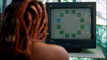
A few months ago I read an intriguing article about the reality/non-reality of color that really got me thinking and I've wanted to write about it here ever since. The problem is that I don't want to get all scientific and intellectual because that's over my head and kind of mind-numbing. I also don't want to copy excerpts from studies and articles on the subject, so here goes...in my own words: Do you think you would know "blue" if you were born without sight? If you see something bright yellow, do you have a unique "feeling response"? The reality is that a large portion of our brains are stimulated by color in unexpected ways, completely unrelated to the hue or wavelength of the light reaching our retinas. We interpret a green lawn as green, regardless of whether the shadows of a tree make that green more of a blue. Our mental associations with color are anchored in our experiences in this world. Have you ever noticed that a mere suggestion of a color, without seeing it, fires up your mind? Pink is a good example (even though there's a feud over whether it is even a real color or not!) But think about pink for a minute and your brain will imagine a rose, a baby blanket, your favorite sweater; all of them 3 dimensional objects your brain has categorized as pink to help you interact with your external world. Color perception seems also to be linked with culture and language. A tribe in Africa is able to distinguish and name several different shades of green, but could not pick out an obviously blue square amongst a grouping of green ones. They were able, however, to pick out more hues of green than the rest of us can. Scientist think that until we have a word for a color, we don't "see" it. Our brains seem to be wired to ignore what doesn't appear relevant. Have you heard the phrase: "learning to see"? Artists hear this all the time as they are developing their visual skills. They hear it most when painting from life. It has taken me years to see the reds and violets in the shadows of trees or the warm yellow on the sunlit side of a white house. I remember watching an artist from California paint a grove of cedar trees and her choice for the dark shadows was a warm maroon! The "rule" is that shadows are painted with cool colors, but by golly, that maroon beneath the cool greens of foliage was perfect! Color is influenced by not only conditions of light and angle, but also by relevance and language. It was never relevant to my life whether or not a white house actually was more pale yellow on the sunny side and bluish on the shady side until I started learning how to paint one that rings true to the viewers eye. I've got more to say on this subject, but that's all my brain can take for now. Stay tuned for future pithy posts about the brain and color. Thanks for reading my blog!!
2 Comments
It's been a few years since I got my first initiation into internet website management. I started with what has proved to be the easiest website to construct and maintain: this one- Weebly. It is truly a "drag and drop" website builder, with only a few complicated steps involved to link it to Facebook and MailChimp. Even so, it took me a 40 hour week and lots of YouTube video views to put it together.  Fast forward a couple years...I get a phone call from my local art group leader asking if I would be willing to help out with their website. I'm pretty sure I wrote a blog about this. Whenever I attempt something new I enter the world of humility and humiliation. Most of mine in this case were in the privacy of my own office space as I became familiar with the Wix website platform. It always feels like I am going to blow up the internet, when I'm learning this stuff, but I quickly realized that until I push that little "Publish" button, nothing at all changes on the viewer side. Wix building is so much more complicated than Weebly, but also offers so many more options to make interesting pages. I was able to animate images, add fun little boxes and lines in different colors and styles, use all kinds of fonts of multiple sizes, etc. Once I got the hang of it, it was fun to work on.  Another fast forward to now: I've been invited/recruited to work on The Chestnut Group website and, guess what? A completely different platform: WordPress. And to top that off, it was built for this artist group by actual professionals. Holy moly, there are pages within pages, secret dropdown menus and so many boxes to check, uncheck, ignore, pray over! My introductory experience involved having to decide what to do with boxes that had words like "delete user" "expire member" "block password". Yikes! But, fortunately, I have teachers that have walked me through the various things I'm expected to do. And, since it is so easy to forget things, I've been creating recipe cards for each of the procedures with step by step instructions.  So....all that to say, along with all the learning that comes with being a professional artist, I am also learning to be an amateur webperson. (Just can't bring myself to say WebMaster) I think it's been really good for me to stretch my brain muscles and gain confidence; but also it's helped me understand and be compassionate for my friends who don't feel comfortable in this computer age. Everything is changing and it is easy to be left behind, left out, if you don't keep up with technology. Hey, if I can learn, you can learn! If I can do it, so can you! Be a boss and do something techie today!! |
Hello! My name is Wendy and I am passionate about oil painting! Whether in the studio or out in Mother Nature, I get lost in the experience of capturing on canvas the moment and the feel of what I am painting. I pour my love and energy into every single piece of artwork and I hope it shows! This blog is a place where I can use words to talk about art, painting, life, faith, things that make me laugh, and things that inspire. I love every response, so don't be shy about leaving a comment...Archives
June 2024
Categories |


