 Life seems to be colored gray right now with the passing of Robin Williams. If your only impression of him is based on his hyper, frenetic craziness then take a listen to this sweet interview I heard on npr the other day. I've noticed my Facebook friends posting tender and thoughtful links about depression, suicide, loneliness and I am hopeful that we are all deciding to be kinder and more caring to each other. It makes me think about making gray...
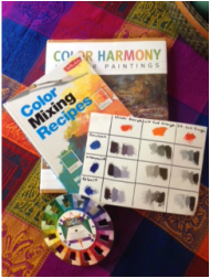
Mixing colors is an educational challenge all its own and some of us (me) are slow learners. It's taken a long time to get a comfortable understanding of the tube colors: their names, their properties and their uses. When I was starting out I thought I'd never remember any of this. It's getting easier now that I am painting faster and more frequently. Every color (or hue) has a complement and when you mix two complements together you will get a gray. In some cases it's so dark that it approaches black. Pick a color, look on the color wheel for the opposite/complement, mix them together and add white as needed and you will have some type of gray. For a long time I started with purple, adding a warm yellow and white, and ended up with a concrete-ish shade of gray, which is great for a painting of a statue. Another stony gray comes from mixing a cool red (alizarin crimson) with a cool green (pthalo green), which initially is a very clean and dark black until the white is added. Lately my favorite gray is coming from mixing a blue hue with orange. It gets a little tricky because both these colors tend to come with a bias (blue-green or blue-violet/ orange-red or orange yellow.) I actually returned a tube of orange because it was so biased to yellow that I ended up with green, not gray, no matter what blue I used. It's handy to make little color charts like the one in the photo, and helpful when learning just which tube of paint to grab. If you zoom in you can see how that first orange has enough of the red bias to make the gray lavender, a perfect shade for a distant mountain. I hope this hasn't bored you silly, or if it has, then I hope you are as silly as Robin W. was. Have a gray(t) day!!
0 Comments
Leave a Reply. |