|
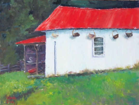
A few months ago I read an intriguing article about the reality/non-reality of color that really got me thinking and I've wanted to write about it here ever since. The problem is that I don't want to get all scientific and intellectual because that's over my head and kind of mind-numbing. I also don't want to copy excerpts from studies and articles on the subject, so here goes...in my own words: Do you think you would know "blue" if you were born without sight? If you see something bright yellow, do you have a unique "feeling response"? The reality is that a large portion of our brains are stimulated by color in unexpected ways, completely unrelated to the hue or wavelength of the light reaching our retinas. We interpret a green lawn as green, regardless of whether the shadows of a tree make that green more of a blue. Our mental associations with color are anchored in our experiences in this world. Have you ever noticed that a mere suggestion of a color, without seeing it, fires up your mind? Pink is a good example (even though there's a feud over whether it is even a real color or not!) But think about pink for a minute and your brain will imagine a rose, a baby blanket, your favorite sweater; all of them 3 dimensional objects your brain has categorized as pink to help you interact with your external world. Color perception seems also to be linked with culture and language. A tribe in Africa is able to distinguish and name several different shades of green, but could not pick out an obviously blue square amongst a grouping of green ones. They were able, however, to pick out more hues of green than the rest of us can. Scientist think that until we have a word for a color, we don't "see" it. Our brains seem to be wired to ignore what doesn't appear relevant. Have you heard the phrase: "learning to see"? Artists hear this all the time as they are developing their visual skills. They hear it most when painting from life. It has taken me years to see the reds and violets in the shadows of trees or the warm yellow on the sunlit side of a white house. I remember watching an artist from California paint a grove of cedar trees and her choice for the dark shadows was a warm maroon! The "rule" is that shadows are painted with cool colors, but by golly, that maroon beneath the cool greens of foliage was perfect! Color is influenced by not only conditions of light and angle, but also by relevance and language. It was never relevant to my life whether or not a white house actually was more pale yellow on the sunny side and bluish on the shady side until I started learning how to paint one that rings true to the viewers eye. I've got more to say on this subject, but that's all my brain can take for now. Stay tuned for future pithy posts about the brain and color. Thanks for reading my blog!!
2 Comments
Betty
3/31/2019 10:22:56 am
That thing you wrote about not being able to see a color until we have a name for that color...that's such a spiritual truth! This might be my favorite blog entry!!!
Reply
Wendy
4/1/2019 07:59:19 pm
Yes! It’s all about learning to “see”...oh, and also learning to be still and accept. ❤️😉🥰
Reply
Leave a Reply. |
Hello! My name is Wendy and I am passionate about oil painting! Whether in the studio or out in Mother Nature, I get lost in the experience of capturing on canvas the moment and the feel of what I am painting. I pour my love and energy into every single piece of artwork and I hope it shows! This blog is a place where I can use words to talk about art, painting, life, faith, things that make me laugh, and things that inspire. I love every response, so don't be shy about leaving a comment...Archives
June 2024
Categories |


