|
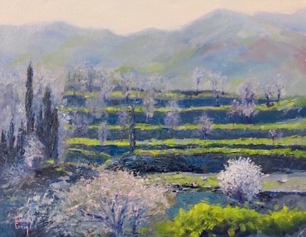
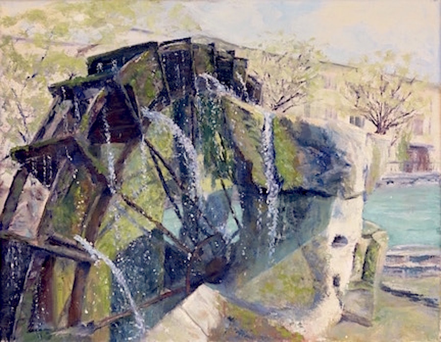
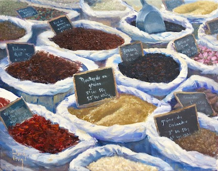
This is the 4th installment of my blog posts on painting theory/composition and the topic now is the importance of developing balance in the picture plane. The goal of an artist is to create a painting that is not only visually pleasing but also stays interesting to the viewer by generating tension and dynamic balance. In an earlier post I explained how diagonal sight lines are much more interesting to our brains, as are irregular intervals, sizes, and shapes. The same is true for balance: a painting with all the information on one side and a large, essentially blank area on the other is not as successful as one that moves the eye across the central axis toward additional information that adds to the story-telling. For example, a landscape may have a barn as a focal point, but also include a road leading to it, a grove of trees in the distance, even a small pond...all these elements carefully arranged to direct the eye around the entire painting (and ideally leading the eye back to the focal point)  In "Tuscany Terraces" I chose the bright, small flowering almond tree on the lower right as the main idea, but then used the irregular lines of the terraced hillside to lead the eye left, across the center, to the copse of cypress and cherry trees that serve to lead the viewer up and along the slightly right-sloping distant trees back to the little almond. The weight of the trees on the left is balanced by the color intensity and focal point on the right. Also, the distance hills fill an otherwise empty top third of the canvas and add to a feeling of depth.  Waterwheel, L'isle sur la Sorgue Waterwheel, L'isle sur la Sorgue This painting of the ancient waterwheel in a small village in Provence, France has a large visual structure filling most of the canvas, but it's easy to see all the diagonal sightlines creating the desired tension and interest. Where do you find your eye going to first? Mine goes to the cascade of water falling through the erosion carved in the stone. Look at the bottom of that cascade and you will see a line of shadow and light pointing your attention back to the waterwheel, then up and around the wheel and back to the cascade. The far right side of this painting finishes the story by adding a little information of where the water is coming from and the village it's in. Because rules of perspective sends the diagonal rooflines out of the picture planes, I had to soften those edges and strengthen the sidewalk tree branches to be interesting enough that they stop the eye and allow the viewer to return again to the waterwheel.  French Market Abundance French Market Abundance In some ways, this painting of a market display in Provence is more of a still life than a scape, but my hope was to capture the feeling I had when I viewed all the baskets and baskets of colors, shapes, smells... What is working composition-wise in this painting? There are lots of diagonals, lots of irregular shapes; the viewing eye does get led around the painting. Is there balance? A focal point? The elements of composition are much less obvious. This painting was a challenge for me, but I went for it and really like the result. I still find myself wondering if I followed the "rules" or broke them. Honestly, I wouldn't change a thing! But I include this as an example of what an artist wrestles with when deciding how to compose a painting that tells the story. Thank you for reading my blog!! (If you don't want to miss a post you can sign up to receive them via email by filling out the subscribe box to the right.)
0 Comments
Leave a Reply. |
Hello! My name is Wendy and I am passionate about oil painting! Whether in the studio or out in Mother Nature, I get lost in the experience of capturing on canvas the moment and the feel of what I am painting. I pour my love and energy into every single piece of artwork and I hope it shows! This blog is a place where I can use words to talk about art, painting, life, faith, things that make me laugh, and things that inspire. I love every response, so don't be shy about leaving a comment...Archives
June 2024
Categories |