|
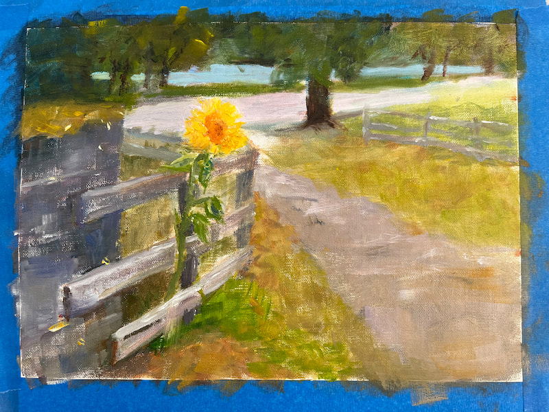
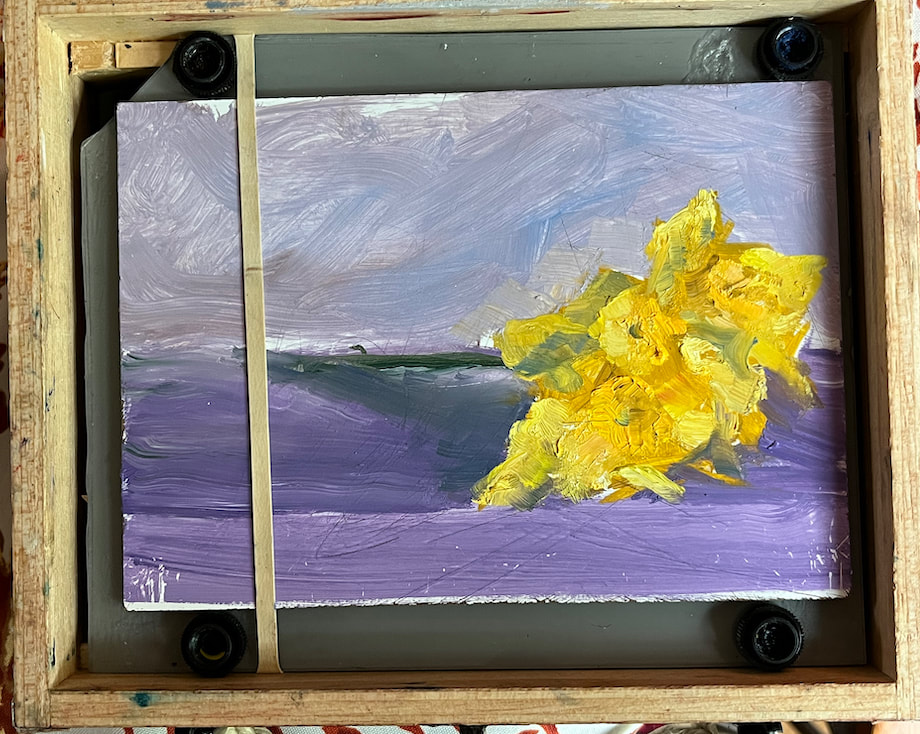
I'm not blogging so frequently now, as you can see. Writing is HARD...it's so much more fun to paint and share the results than to find words that express the process, my feelings, whatever. All I can say is: painting = my happy place and I have a lot of fun with it! So much so that my art gear comes with me pretty much wherever I go. I've got packing down to two small boxes: one holding the paint tubes and a detailed letter to luggage inspectors to "please please do not throw these away! They are nontoxic, water soluble artist colors...and also expensive" and the other box is my bespoke pochade box that I created out of a real cigar box) Here are some paintings I did while in Mexico a few weeks ago:     The Hibiscus speaks for itself, but the other three paintings are of a historic hilltop building that holds a museum of sorts, a menagerie of parrots and flamingos, and a wonderful tapas bar with the best view in town! Yes, I painted a wall with a shelf of amber bottles and books. I loved the texture and composition...that's how I am these days: painting what makes me happy!  These two paintings are ones I started a couple years ago and was inspired to finish them up lately. The yellow-roofed Kauai plantation building was so rickety and authentic. The little gazing girl in the last painting was from one of our Mazatlan trips and we were so lucky to be in that moment when she came dancing up to look at the ocean and beach.  You can find these and other available paintings on my website (wendyervin.com) One more thing: these next two paintings are currently in a fun local show "Sunshine & Shadows" at GallerieTangerine in Nashville!
Thank you for reading, my friends!!
6 Comments
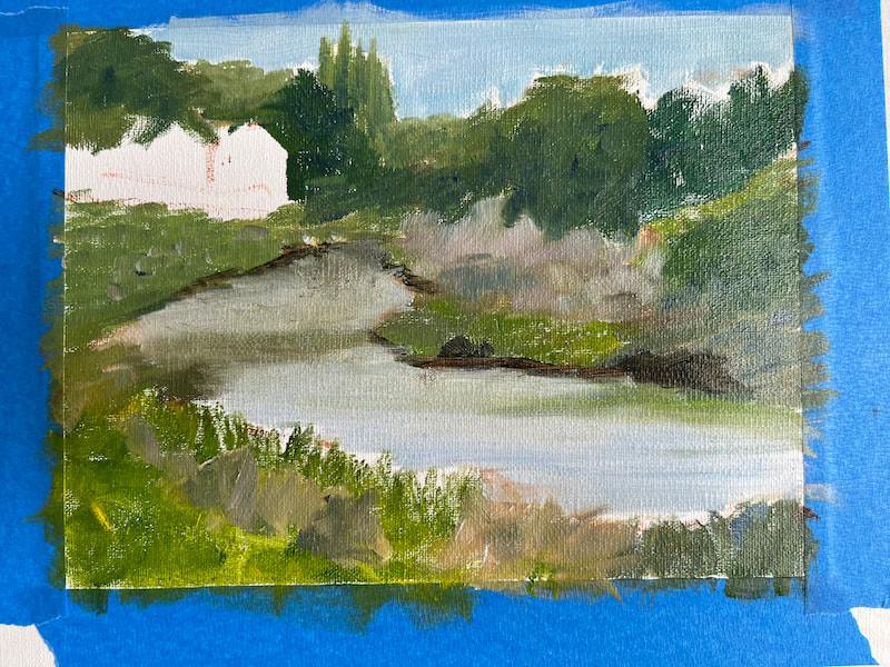
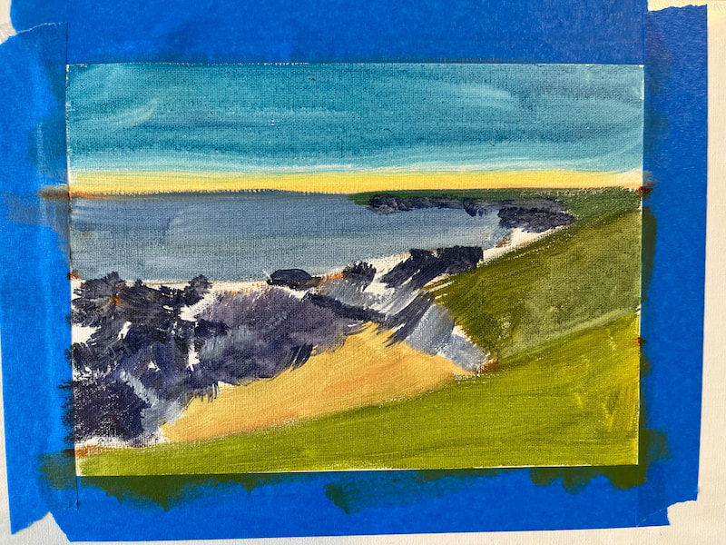
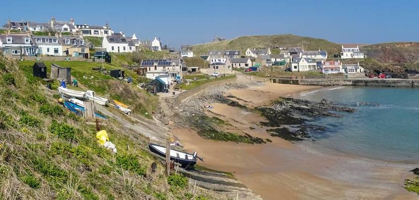 On the edge of the North Sea and 18 miles north of Aberdeen, Scotland is the little village of Collieston where we made our home for the month of September, along with four dear friends. Because we love wild Scotland, we wanted to live in it instead of driving through it. So we rented a beautiful house on the edge of the expansive Forvie Nature Reserve, 100 yards from the cliffs above the North Sea, unpacked our bags and settled in. Collieston was a perfect home base for local exploration: walks in the dunes, golf on beautiful links courses, castles and gardens, whiskey and seafood. The village couldn't have been sweeter and the local people were so kind and welcoming of our American invasion to their community. We made new friendships, lots of beautiful memories, and I was able to do several new paintings. The gracious weather made outdoor painting possible and indoor painting logical when the wind was blowing. Some of the "works in progress" while I was in Scotland: 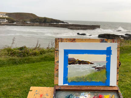 Oof! My hands were so cold! The wind was picking up and soon I was packing my gear to finish the plein air sketch in our warm house. I invite you to watch this slideshow of the paintings from Scotland. On each of the images, I've written a few thoughts on what about that scene made me want to paint it. Size and price varies, but all paintings are 8x10 or smaller, oil on linen panel, unframed. Free shipping. To see these paintings more closely, click here. It was a privilege and joy to spend a whole month in the village of Collieston and explore the beauty of Aberdeenshire. Please do contact me with any questions or post a comment on this blog. Thanks for reading!
"merry and blessed" is my Christmas wish for YOU! This we can be regardless of the storm we may be walking through. I pray that we always seek the Comforter and find rest for our souls.This year I've been painting small and have knocked out more than a dozen 6x6 and 6x8s since June. A couple of them sold in the Radnor Lake show last month and I have 3 currently in the "2023 6" Squared Online Show" Click here to view: 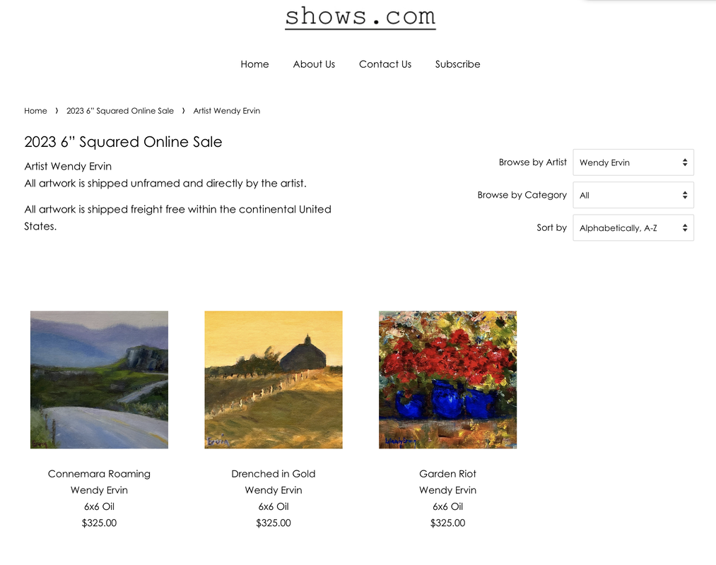 These and all the other little gems in this art show are sold unframed with free shipping. I am grateful to Randy Higbee and his crew for selecting three of my paintings to include in this years show! And still to come is my own personal online show of the paintings I did during our month in Scotland and from photo memories in my studio the past few weeks. Hopefully I will have several ready to share by mid December. Thanks for reading my blog and remember.... You may be wondering, "is she still painting?" and the short answer is: Definitely Yes! I've been quiet about my work lately as I've been leaning in to what painting means to me and how I can respect my own voice in what I create. That sounds a little highfalutin, so I try for language that is simpler and more straightforward. There is an uneasy relationship between creating art and selling art and I have wrestled with that for a while now. I'm not alone as I read the posts and blogs other artists are writing. Maybe it was the pandemic that slowed art sales in galleries, resulting in many of them closing their doors. Add to that the trend of poster art, catalog art, prints, and knock-offs. Artists can watch what's selling like every successful entrepreneur and many do adjust their subject matter and style to what's "in". There's no end to the "marketing resources" offered to creators, too. I've done a lot of soul searching and decided that isn't for me. Life is so short and unpredictable to spend it making a name for myself. Even now as I write this, there are two wars raging and so much suffering around the world. If I want to say anything with what I paint, it's to express peace and beauty, with a little mystery thrown in. So if I'm painting up in my studio or on the road in our travels, it will always be from my heart and for the sake of art. These five paintings will be in the Radnor Lake Art Show and Sale November 3-5 in Nashville. You can read more details on my New Paintings Page.  Walter Criley Visitor Center
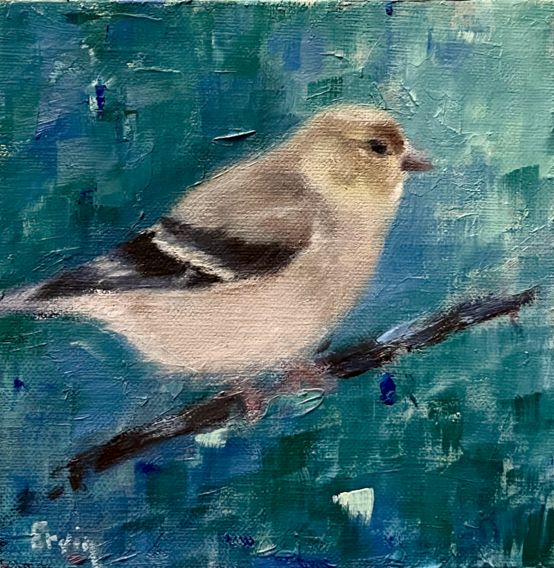
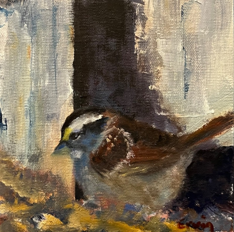
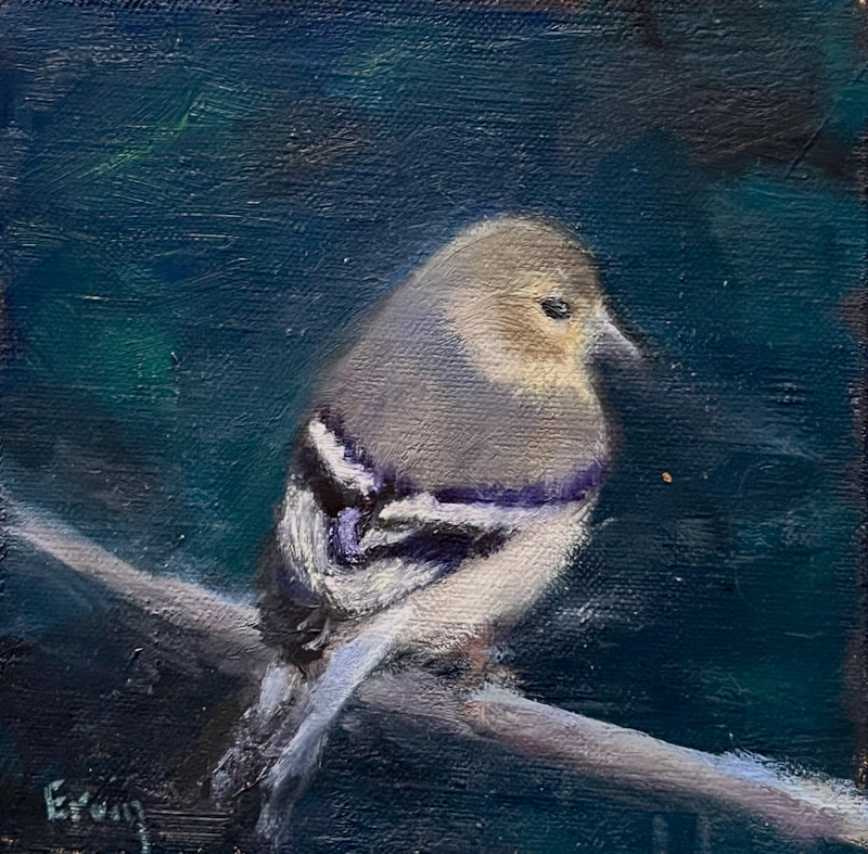
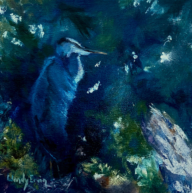
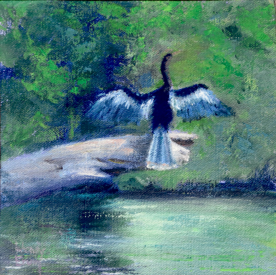
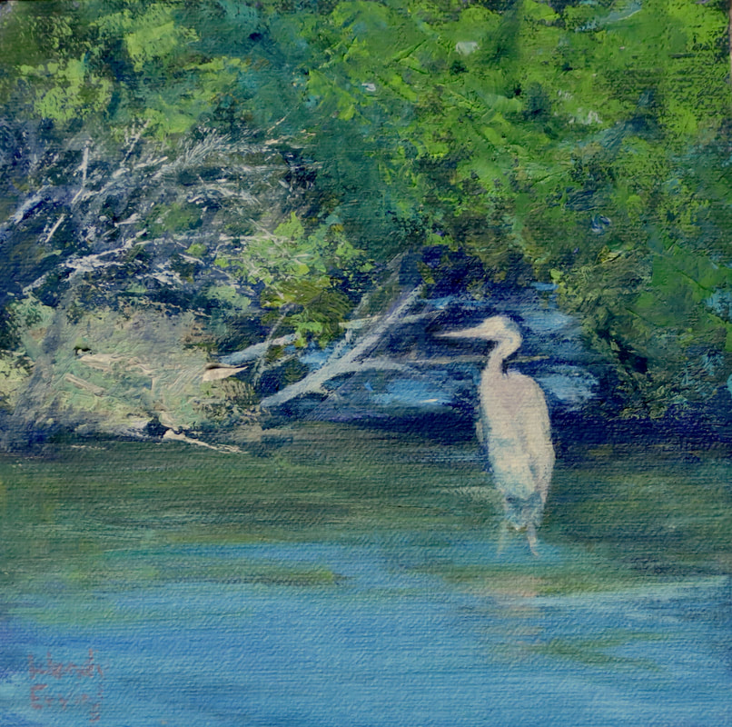
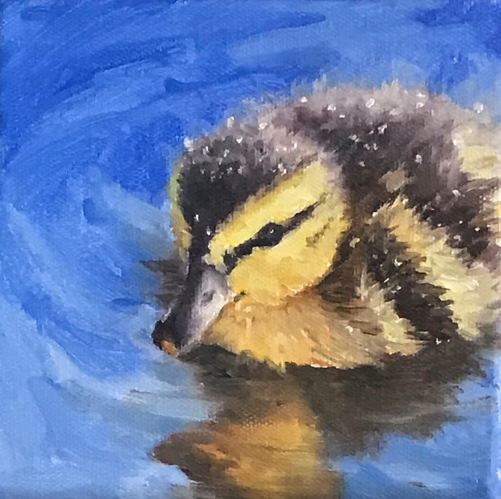
November 3-5 Celebrate Radnor Lake in the year of their 50th Golden Anniversary! One by one, our 3 cats crossed the rainbow bridge in 2022. So sad and hard; we miss each one of them so much! Over the months of being cat-less, word has gotten out to the birds. Our birdfeeder has become the "It Place" amongst the feathered friends. Fun to watch and learn and get inspiration from so I set up my tripod with a Canon camera and took a few (hundred). photos to reference for paintings.
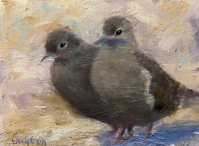 Mourning Doves 6x8 Oil Linen panel Losing edges is another technique that makes a painting loose and painterly. It brings a softness to the subject and lets our marvelous brains fill in the details. It even seems to help tell the story by not giving all the information upfront. This sweet pair of doves pretty much live in our backyard now; coming and going and always coming back. Too big for the feeder, they forage below where our cheerful cardinals toss out seeds they're not as fond of. Do you see where the edges are "lost" and "softened"?
I love our little songbirds of the South, but my favorite of all is the delightful, sassy Carolina wren. Lots of lost edges is this painting. These wrens are spunky, bouncy, flitty wee characters. I'm sure I will be painting them again and again! 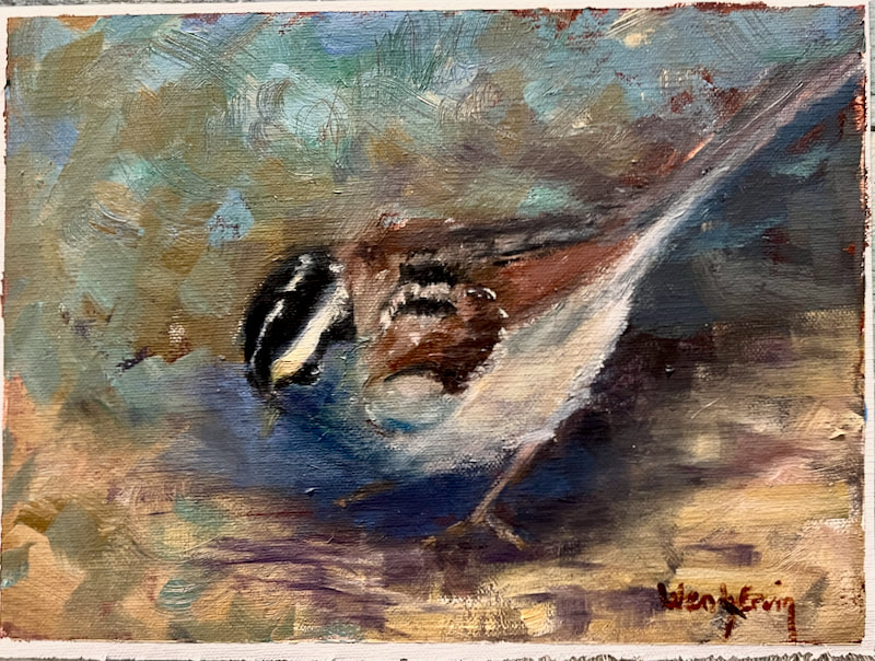 Carolina wren Foraging 6x8 Oil unmounted linen canvas Thanks for reading my blog! Comments welcome. These are small, affordable original oil paintings; contact me to purchase. [email protected] Cheers!
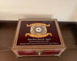
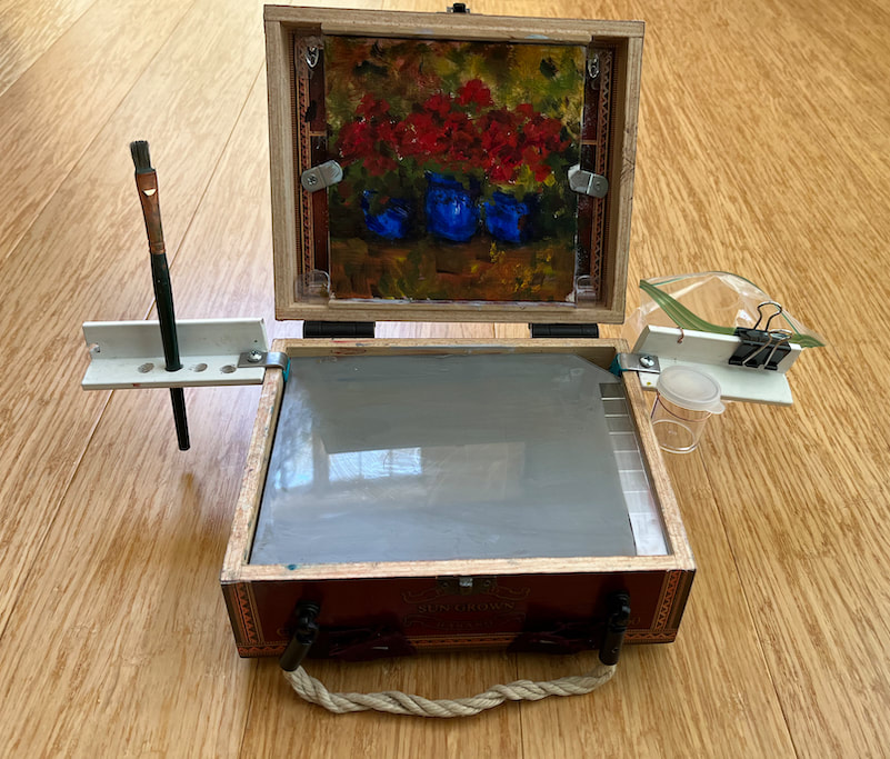
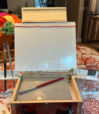
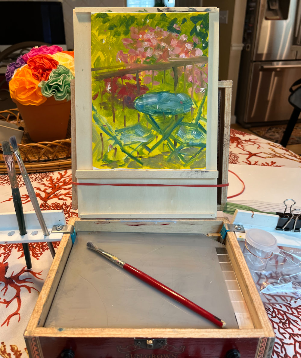
I am sharing a slideshow of some of my 2022 paintings...no captions, just art. Put a little music on, relax and enjoy. A few of these are WIP (works in progress) so don't get too critical 🥴 I caught a little "writer's block" lately so my New Year's resolution is to blog once a month. The good news is I don't have "painter's block"! So this post will be a little different but, hopefully, still of interest to most of you. One of the issues that holds me back from painting outside is all the equipment involved. I have streamlined my needed supplies significantly but still require a tripod, pochade box (to hold my palette, brushes, canvas, etc. Typically I have one largish shoulder tote bag and the tripod with a shoulder strap, and a wet painting carrier. In all honesty, setting up my stuff makes me feel moderately conspicuous, especially in public areas. I enjoy painting so much, but not becoming an attraction or nuisance (yes, that happened🙄). So I've been searching out a more low-key approach: a cigar box! With a small, all-inclusive box I could paint almost anywhere with minimal supplies and no tripod.
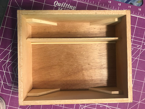
Step 1 was to locate all the YouTube videos and blog posts on how other artists tackled the upscaling of a cigar box and decide on what I needed my design to be. With the nice depth, I knew I could get at least 2 layers of storage, so the MacGyvering began with removing the flimsy hinges from the back and separating the lid and box.
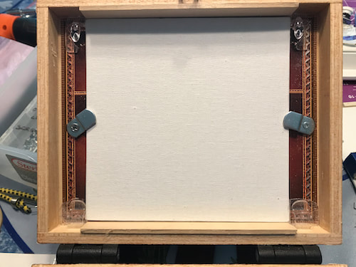
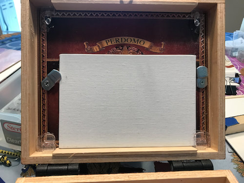
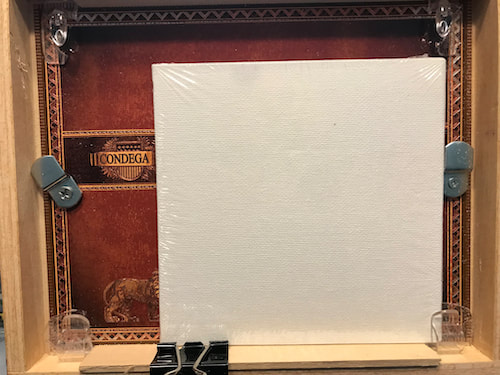
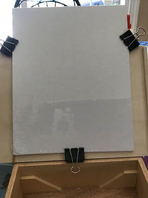
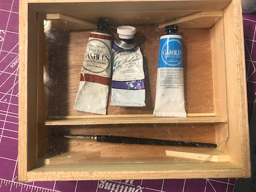 Paint tubes and brushes fit nicely in their compartments. Moving on to (step 3) the new torque hinges, which allow for the lid to stay in position while painting. I had to make a trip to Ace Hardware to get short screws that didn't go all the way through the box interior. Yes, I was a little nervous about doing this step, but it worked out fine. 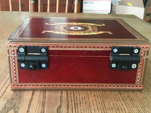 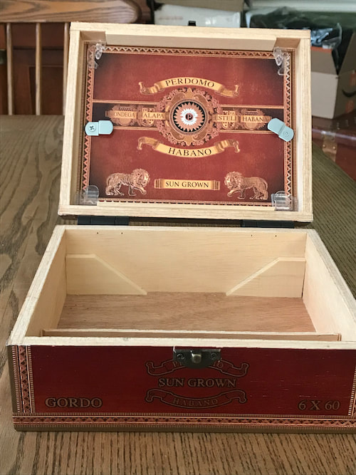 Step 4: Now to the lid...it has a 3/4" depth, perfect for small panels. It took me a couple of days to decide how I wanted to hold the panels in place and came up with two clip ideas: the first clips are metal 1/8" offset clips, attached with the tiniest screws I could find so they didn't perforate the outside of the lid. They're installed with a tiny washer so they swivel to hold a 6x6 panel in place. The second clips are the clear 3M Command clips, trimmed to hold a 4x6 panel but not get in the way when working on a 6x6 panel. I mistakenly put them at the top first, but taking them off would tear up the cool decal, so I left them and put 2 more at the bottom.
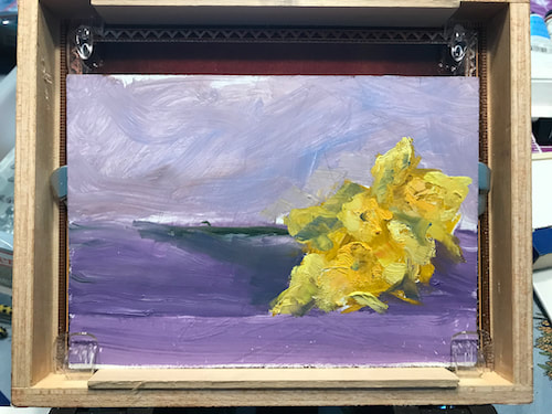
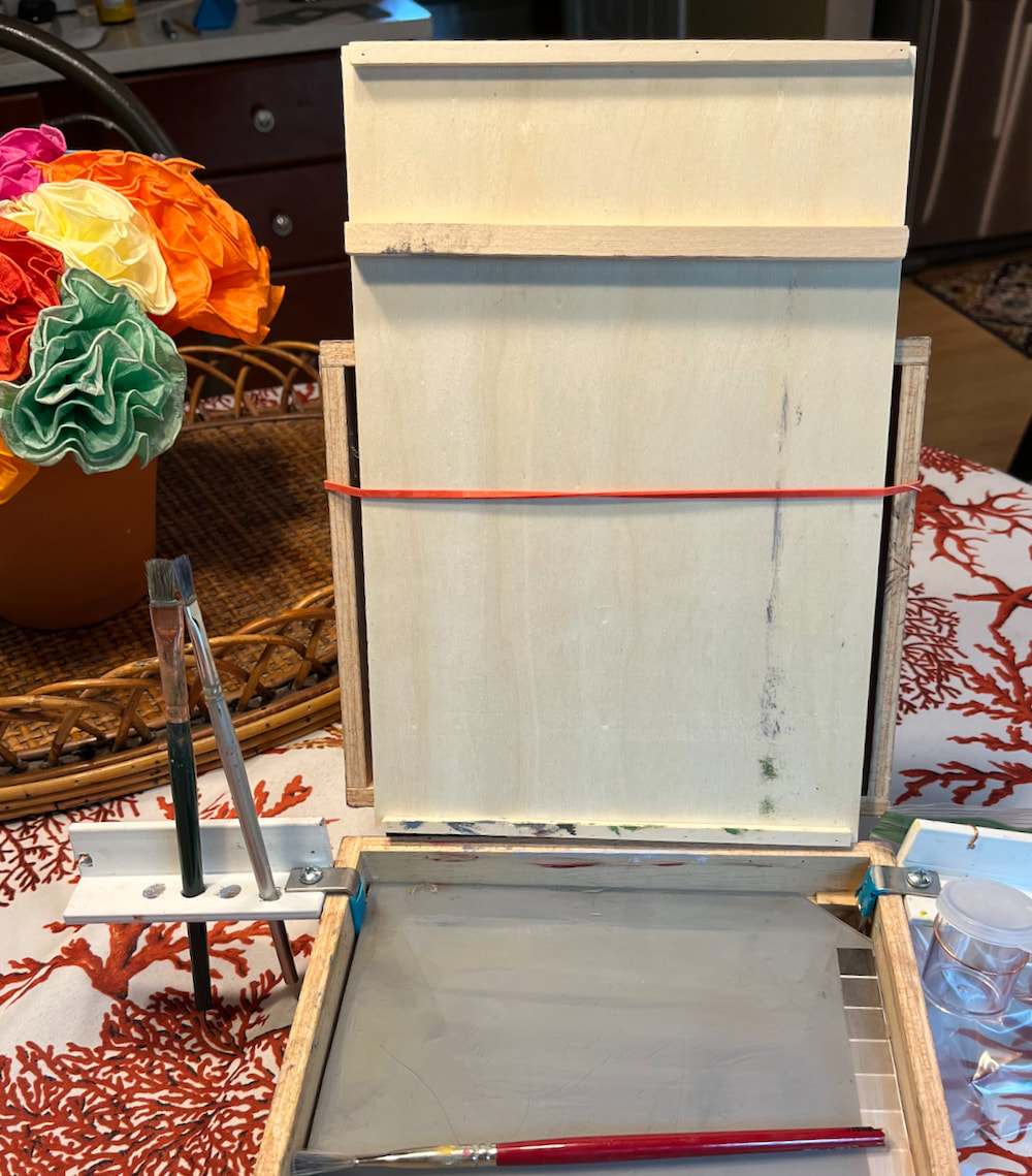
This is what the lid looks like with a 6x6 panel in place. The torque hinges allow for moderate brushstroke pressure, as well as being unaffected by wind or gravity. I glued 1/8" craft wood pieces above and below to make it easier to paint the panel edges. Several sizes of small panels will fit inside this box lid: 4x6, 5x5. 5x7, 6x6, etc.
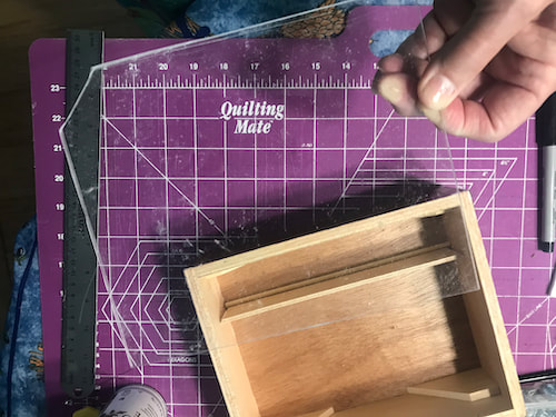
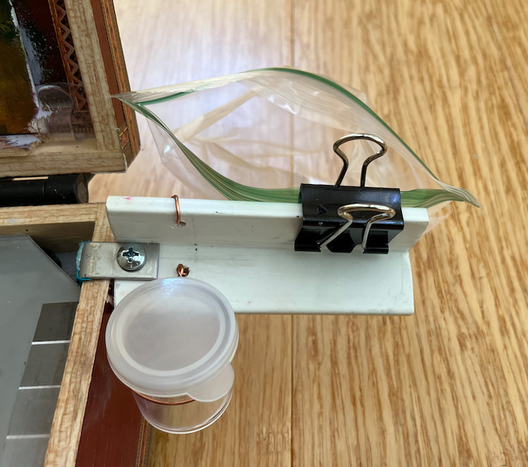
Step 5: To create the shelves, cut 2 rectangles of plexiglass to fit inside the box dimensions. Home Depot and Lowes both carry small sheets of plexiglass and it's relatively easy to cut with a sharp box cutter and ruler. 30 or so strokes with the blade and the sheet will snap apart with pressure. I painted the underside of each shelf with a mid-value gray acrylic paint and got a little fancy by adhering a value guide to one of the shelves. Cutting off a corner makes lifting them out much easier.
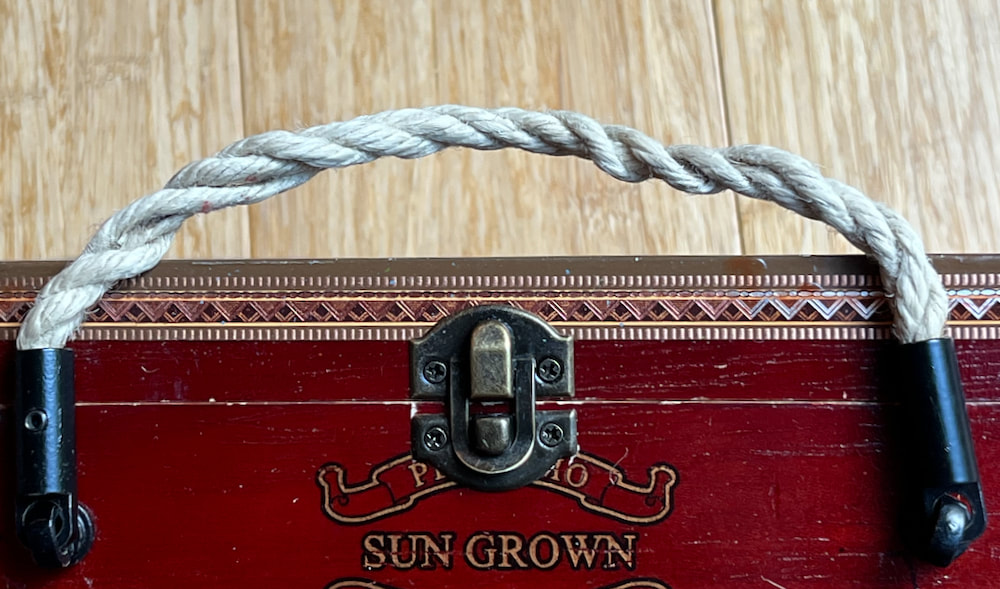
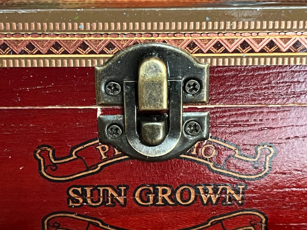
The lowest shelf is intended to hold the supplies below it in place during transport and also hold a small, wet painting in place using an extra big rubber band. I glued spacers (these are paint tube caps) in all 4 corners for the top shelf to rest on without touching the wet painting. The top shelf becomes the palette for my paint colors. The smooth surface is great for laying out and mixing the oil paint. 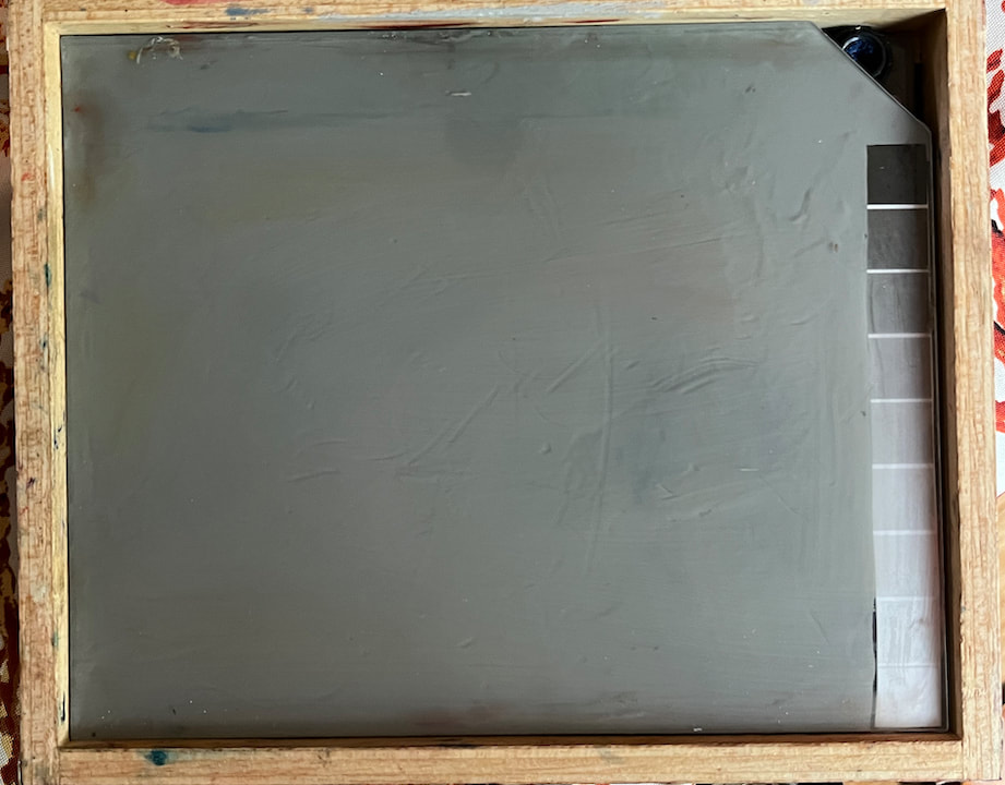 upper shelf Step 6: The box definitely needed a better, stronger latch and a lightweight but sturdy handle. Found these at a hobby store. Not sure which way to attach it ... I think I put the latch on upside down. haha! Again, I needed very short screws to prevent them from going all the way through to the interior. I had to saw off the integral screws that came on the handle and using a nut on the inside of the box to hold them in place, making sure it didn't interfere with the level of shelf supports. A little tricky.
Step 7: Add-ons
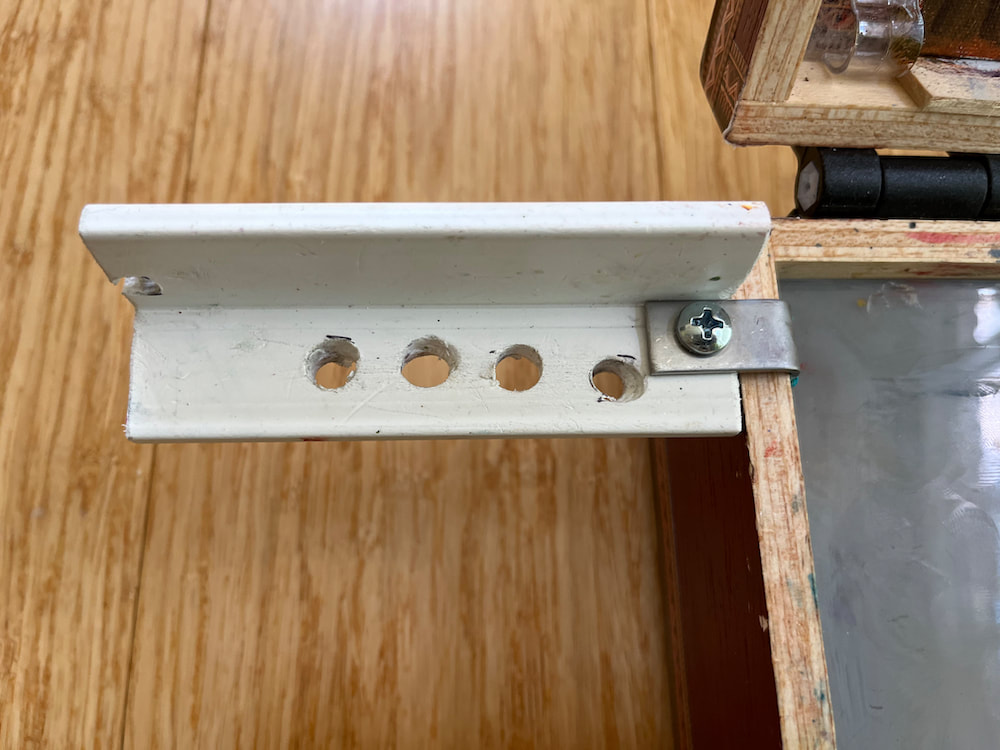
I did a trial run in my backyard and quickly learned that I needed some extras to manage the brushes and solvent: so side-wings were created out of some pvc L trim we had in the garage. Holes were drilled, L-brackets attached, a wire hoop to hold a tiny cup for turp was added. The metal L-bracket slides over the box edges and is held loosely in place by gravity and the plexiglass shelf.
Step 8: Knowing there may be times I'll want to use a larger panel than will fit inside the box lid, I worked out an accessory unit from a light-weight wooden lid I had on hand. Measuring 11x7.5", it could hold panels up to 9x12 using a large 7" rubber band fixing it to the cigar box lid and another band (or clips) to hold the panel on. The extra weight with the larger panel does make the box more difficult to manage.
This was a surprisingly fun project to do, requiring lots of mental planning and measuring and problem solving. Having a small pochade means limiting my color palette, cutting off the ends of paint brushes to fit, finding tiny containers for turp and medium, but it also opens up so many more opportunities to do plein air sketches, to paint on vacations, to be spontaneous. With this box, I can carry at least 2 wet paintings, paint at least 8 different size panels. have at least 6 paint tubes, 4 brushes, plus some other stuff. I'm looking forward to some happy painting!
Thanks for reading my blog!! Getting ready for the Art Exhibit in beautiful Anacortes, Washington and you are all invited! I will be there on opening night and would be delighted to see my PNW friends. If you can’t make the opening, the show goes through late August. I am very grateful for my bluebird painting to be included in this year’s Little Gems exhibition ❤️ 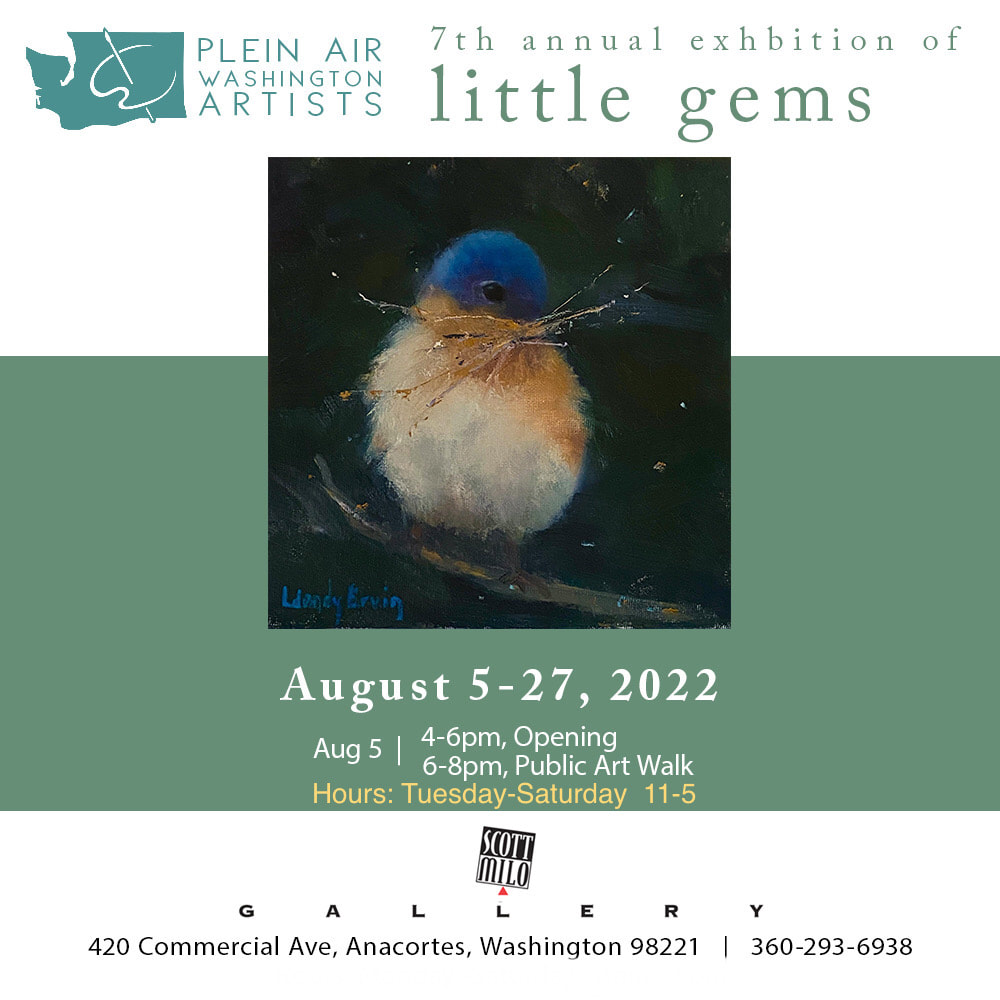 It is HOT here in the South...but I love it! It took me a couple of years to adapt and definitely the swimming pool makes a huge difference. The sights, smells, and sounds of the southern summer have become a part of my soul; lots of flowers, thick tree canopy, songbirds and cicadas, fireflies and dragonflies, urban wildlife (our local deer herd with this year's fawns who nap behind out fence), torrential summer downpours and random thunderstorms, all of it make me feel blessed and happy. 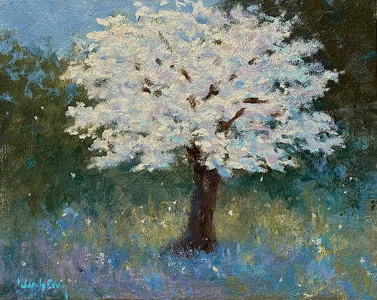 Dogwood Dreams 8x10 oil on panel SOLD It's a little more challenging to paint outdoors in this heat as summer deepens, so most of my painting hours are spent in my studio, either doing still life, quick paints, or larger versions of earlier small studies. I've been consistently painting smaller (8x10 or less) and faster, looser, and with thicker paint. It's been a freeing change for me and I've been liking the results. 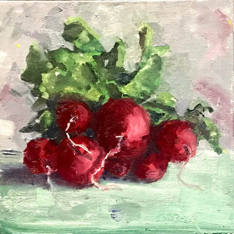 Radish #3 6x6 Oil on panel Available You can find many of these small paintings on my DailyPaintworks gallery, where they are available to purchase for a very reasonable price. Most of those listings are of birds, but I will begin to include a variety of subjects in the next few months. 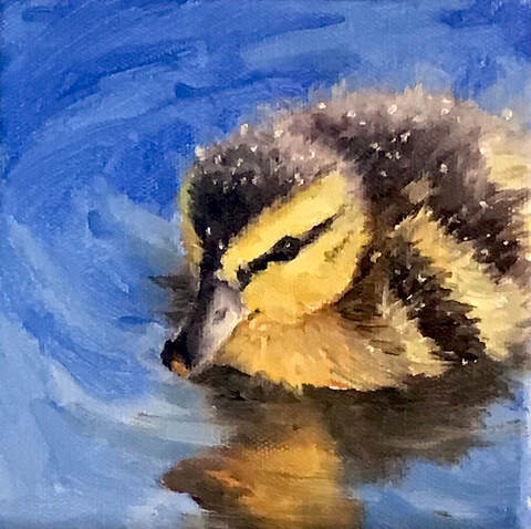 Lil' Quaker 6x6 Oil on canvas Available on DailyPaintworks I am very happy to announce that my painting, "Heart Full of Hope" has been juried into the Plein Air Washington Artists (PAWA) "Little Gems" art exhibit and sale to be held in Anacortes, Washington at the Scott Milo Gallery August 5-27!!! We moved from that beautiful region almost 20 years ago and are blessed to return yearly, or more, to a lovely community of friends and family. It is quite a thrill to be a part of PAWA and humbling to be included in this beautiful art show! And even better, I will be there in person, probably making all my PNW friends come with me to the show! 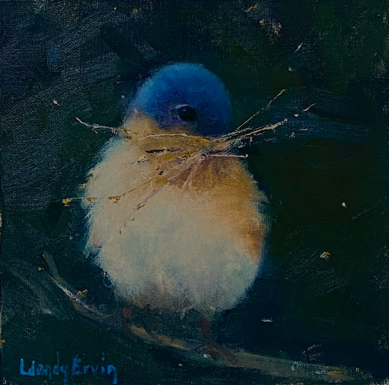 Heart Full of Hope 6x6 Oil on panel On Hold Thank you so much for reading my blog! Comments are welcome and rejoiced over, so please feel free to leave one 🥰
I may have contracted "writers' block"...or is it "writers' blog block"?? Either way, my monthly blog fell by the wayside. I'm going to attribute it to my husband's retirement... whatever. The good news is I am still painting regularly and have work to show for it. If you are on my Instagram or Facebook pages, you may have seen what I've been doing; lots of small quick paintings with a limited palette. This is one of the painting exercises we are taught to do daily, if possible. Most are pretty basic "studies" and nothing to write home about. Keep up the habit and skills will improve, with good drawing, composition, values, and colors. I'm learning to free myself from expectations and finding a new flow, with the aim of expressing my unique voice amidst the myriad of painters out there. BIG NEWS!! I have second website (in addition to wendyervin.com) specifically for the small paintings that I love to do. I'll be adding paintings to that gallery page often and the prices will not be over $150, with most being under $100. The PayPal link will be right there for easy purchasing, safe and secure. I'm going to be bold here and say that you need original art in your home. It doesn't have to be big or expensive, and I'm doing my part to make it affordable. Here's the link to my DailyPaintworks Gallery: https://www.dailypaintworks.com/Artists/wendy-ervin-14174 You don't need to join DailyPaintworks to make a purchase, but you must have a PayPal account. If you don't do PayPal, just contact me and we'll work it out. Here are a few of the paintings available: As always, thank you for reading my blog! Your thoughts and words are so important to me!!
|