|
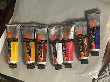
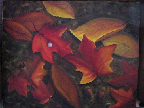
Even when I am on vacation I am itching to paint. A funny thing happens to me if I go more than a few days without putting a brush to canvas...I start dreaming about babies! Once I'm painting again, the dreams cease. (side story: these dreams were nightly in the year or two before I started art lessons and stopped once I began painting regularly. Feel free to analyze that 😊) This trip I decided to try a new-to-me product that would make traveling with oil paint a bit easier. These are called water-miscible oils; true oil pigments that contain a modified oil binder that can be thinned with water rather than solvent. Normally I used only small amounts of Gamblin Gamsol odorless mineral spirits for the initial wash of paint onto the canvas and for cleaning brushes. I've tried going without it, but struggled with sticky paint and messy cleanup. My routine when traveling, since airlines do not allow flammable materials on planes, has been to hit up an art store upon arrival and buying a small bottle of mineral spirits, which can be a hassle in a foreign country. Many artists have switched to alternatives, such as watercolor, acrylic, gauche, and water-miscible oils. After much research I decided to try the latter and read that Royal Talens Cobra paints were well liked for their buttery consistency. I would agree now that I've used them! They were so easy to work with and cleaning was a breeze...warm water and dish soap. They have very rich chroma and are so juicy that medium (to increase fluidity) was not needed. The best part was that I could use a bit of water to wash on a thin first layer of paint; an important step in the "lean to fat" oil ratio rule.
I would love to say that I painted plein air, but it wasn't in the cards for me this trip. What I did was use photos and color notes to inform the paintings I created in our condo. There was a perfect little nook for me to set up easel and palette and have my fun without being a nuisance. And, yes, my dreams of babies stopped when my painting resumed!
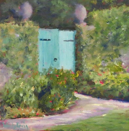
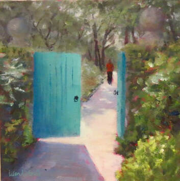
 first responder accommodations, Mexico-style Thanks for reading my blog!!
2 Comments
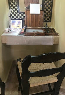
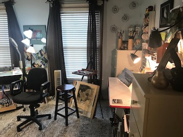
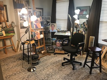
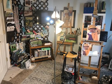
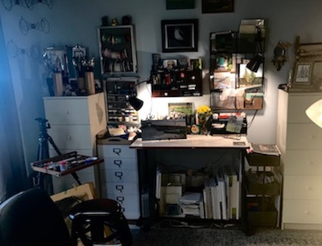
The past several weeks have been quite busy with exhibit deadlines and commissioned paintings, so it's been a fun change of pace to suddenly be inspired to update my studio with a new look and feel. I don't have "before" photos, but just imagine carpet remnants on the floor, rickety folding table for my palette, paint tubes under the easel, and not much space to move around in. (Being smallish and having good balance was required) The renovation started with my dear husband offering to put the tv up on a swivel wall mount. I hadn't really thought it necessary, but once it was up I realized that now i didn't need a large cedar chest it had been sitting on in that corner of the room. That's when the rearranging began and the studio took on a whole new feel. Taborets are specialized cabinets for serious artists, often at serious prices. Pinterest led me to some great DIY versions and some alternative substitutions, typically tool carts. One day I saw an ad for a movable computer cart, dove down that rabbit trail and found a great one with swivel wheels, 2 shelves, and a drawer for a fantastic price. Now I had a way to keep the brushes and paint tubes organized and a convenient surface for my glass palette to rest on. The crowning touch was taking out the messy pieces of carpet protecting the floor from those disastrous moments when the brush flips out of my fingers, or the turp container sloshes, or (worst of all) the painting takes a nose dive off the easel. I had to replace those old chunks of carpet with something sturdier than the waterproof cloth canvas protector... Aha! Spring merchandise showing up at the retail stores presented me with outdoor patio rugs, a perfect solution. Somehow the simple removal of a couple things and the rearranging of a couple more has made the room feel so much more open and spacious...and tidy! Even though there is snow falling outside my window, it feels like Spring cleaning has already begun!
You can see a video of the transformed studio on my Instagram page here. Thanks for reading my blog!!
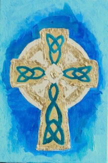
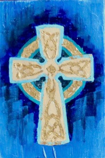
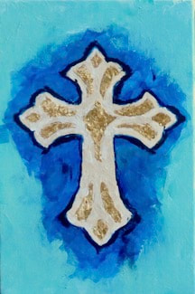
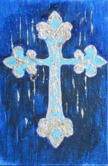
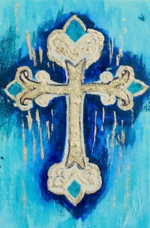
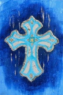
Recess is important! Taking time to play and discover can open new doors of imagination, boldness, and refreshment in all the other things we do. Being a grownup does not exempt us from the benefits of playtime. After an intense 2 weeks of full time painting for the 6x6" Squared show @ Onlinejuriedshows.com I was ready to switch directions and try something new. It's been on my mind for awhile to do something with Celtic crosses. I wasn't sure what I wanted to create exactly, but I knew it had to be shiny. So I started playing with design ideas and colors and shiny possibilities and came up with 6 little paintings. Initially, I laid in acrylic paint thinking it would dry quickly and allow for multiple layers of paint. That's how I discovered I really dislike painting with acrylics. The consistency wasn't the yummy, buttery feel of oils and was difficult to apply to the tiny spaces of the Celtic designs. I switched back to oils and then had to contend with the slow drying time. (note: oils can be applied over acrylic paint, but acrylic cannot be applied over oil paint...it will slide right off) Once I had the oil colors applied the way I liked, I went for the shiny element. YouTube is very useful for learning new things and that's how I learned to apply gold leaf. It is surprisingly simple: carefully apply the recommended glue on the areas you want the gold to be, let it sit for half an hour, then place the gold leaf onto the glue. I used flakes in this project because the spaces were very tiny. It was a bit of a messy step, but kind of magical! Sweeping away the excess gold with a soft brush and polishing them a bit, the crosses now looked very sweet and shiny. Of course, even trying to be careful, there are now flakes of gold here and there in my studio. Being shiny.
I made these just for the fun of it and gave them all away. Maybe I will make some more next recess :) Thanks for reading my blog!!
I am so happy to share that all 5 of my submitted paintings were accepted into the 11th Annual 6" Squared Exhibition and Sale! This year the sale is ON-LINE and there are over 400 paintings to choose from. Do consider buying a painting from one (or more) of the artists here. If any of my paintings speak to you, I would be honored if you purchased one of mine. Purchases are made through the OnlineGalleryShows.com and shipping is FREE!!
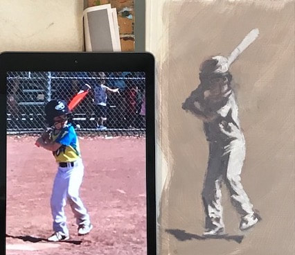
I believe that I've mentioned a few times my deficit in drawing skills and the need to get some help with it. Eager to learn painting, I kinda skipped that important foundation. Oopsie. The problem in my early artsy days was three-fold: I didn't want to take the time, I lacked the discipline, and I didn't like my results. Under heavy conviction, I finally took the steps needed to do a drawing class. My instructor, Jim Himsworth, teaches at Warehouse 521 Art Studio in Nashville and is an excellent artist and a patiently kind teacher. He quickly showed me various ways to assess lines and angles and he reminded me to see shapes, rather than "things." I can't help feeling a bit dyslexic when it comes to seeing angles...mine are always just a bit too slanted. Jim suggests mentally overlaying a clock face and judging what time that angle is tilting towards. I need more practice (while I blame astigmatism for my wonky angles haha!) 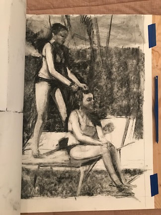 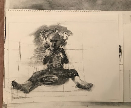  Figurative painting has begun to appeal to me, so I mainly focused on the photos I've stored my inspiration folder. Lines, angles, ratios, and relationships are unforgiving in portraiture and figurative art. Let me tell you, my brain was exhausted after 3 hours of charcoal sketching, wiping, trying again. Also, linear perspective can be a challenge...again with the wonky lines problem. 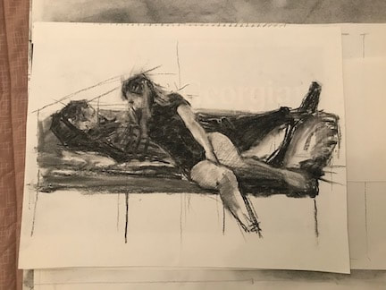 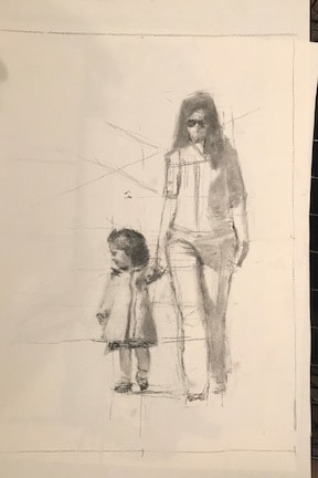 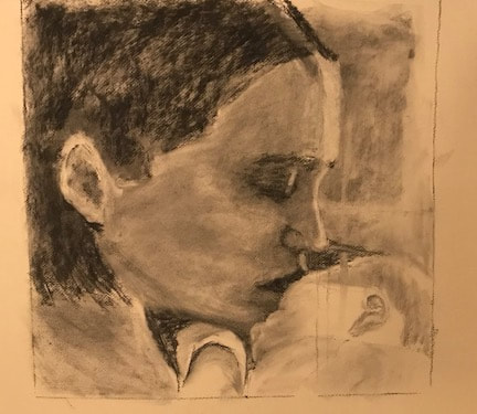 Having a Beginner's Mindset opens so many opportunities for experiences and growth! Simply being curious instead of defensive is a great start. Add "maybe" and "why not?" to your vocabulary and see what you learn and how you make other people feel. On one particularly discouraging day in drawing class, I found myself feeling defensive and withdrawing from instruction. I thought I should have improved faster; I had expectations of myself that I had to confront with compassion and patience and it helped to remind myself that growth takes time and perseverance. I had to go back to "maybe"...maybe I'll do a little better next try, maybe it'll take practice to train my eyes to see...just doing that simple retracing of attitude was enough to refresh my spirit and find a bit more courage.
There is a kind of freedom in being open, listening, breathing, waiting, and welcoming new ideas, people, and experiences in. It's glorious that we have that choice! This weekend my most recent painting will be presented to a much loved woman who has been experiencing loss and separation during this difficult year by her truly caring friends, wanting to show their support through this very unique gift of art. What a privilege it was to paint her precious granddaughter with her gentle dog and to hear the story of these friendships. Most of the time painting is a solitary experience; a perfect match for an introvert like me. I can happily spend many hours experimenting with colors, creating work from photographs, setting up still-lifes...but then I do begin to wonder, what is the meaning of this? Is it a "calling" when someone commits their path to artistic expression? What purpose does Art play in the human experience? How would our world, our communities look without music or murals, without sculptures, gardens, without unique interpretations of beauty? Remember that Malcom Gladwell quote about 10,000 hours of practice to become an expert? That is a lot of time focusing on a single discipline (I might be halfway there!) The time I've spent has, in a way, been a form of obedience, as well as freedom. When that nudge years ago became an urgent pressure from God to sign up for painting lessons a whole new door opened for me. I'm not saying it wasn't hard work, but it also unlocked and continues to unlock a creative flow within. This sounds self-centered but I don't mean it that way at all...I want whatever I do with my developing skill to go out into the world, to make a statement of beauty, mystery, spiritual truth. When Kathryn's email came out of the blue to discuss a commissioned painting for her friend, I was humbled and delighted to find out that this obedience and freedom was moving out and into the places in the world where it is designed to go. I love that so much! I don't have to struggle with ambition or fret over measuring success. I can remain free and open and let God use this art in any way He wishes. Teresa of Avila reminds us that all things will come to an end. The pleasures and power and prestige we enjoy will end when we do; but there are better values that will remain: eternal values of love, faith, and friendship with God.
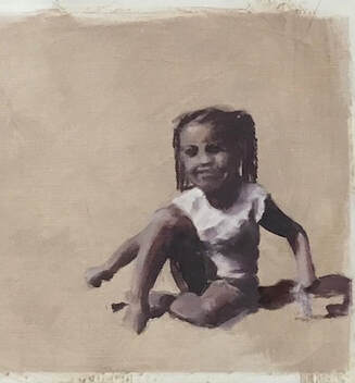
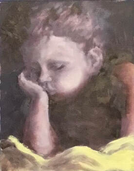
"Be ye also ready. Great and small are here." (on a tombstone at Melrose Abbey, Scotland) 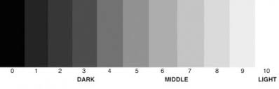 Have you ever noticed how you can see a shape from a distance and know exactly who or what it is? Even when most of the shape is in shadow, our beautiful minds interpret form and attach meaning to it from our reservoir of knowledge and experience. Recently I was privileged to attend a fantastic workshop with a focus on shape and a goal of capturing the gesture of that shape by limiting and controlling the values. In drawing and painting, the term value refers to the relative light and darkness of the color/hue of an object. if you look at a sphere with the light source coming from one angle, you'll see a gradation of shading on the unlit side. The same goes for just about every single object; it is that combination of light and shadow that gives it form. It doesn't matter what color is used as long as the correct value of the color is in the proper placement. Then our eyes and mind will know what we are seeing. 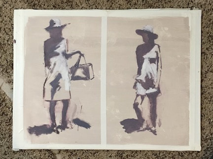 Most inanimate objects do not typically express gesture. A chair, a rock, a shoe all have shape and volume, but are rarely affected by motion. The word animate, either a verb or adjective, is derived from Latin "give breath to, enliven, endow with spirit" and that is what we set out to learn to capture in our paintings during this class. Marjorie Hicks, our very talented, kind, and generous instructor (check out her website HERE) presented us with several photographs of her models in various model-y poses and demonstrated her process of painting in three values of warm gray hues. My painting of the two poses above shows how we start with a mid-value toned canvas. Once I got the drawing lines in, all I had to do was fill in the deepest shadow side with the darkest of my 3 values and then pop in the lightest value where the figure is sunlit. Easy-peasy! (sort of) 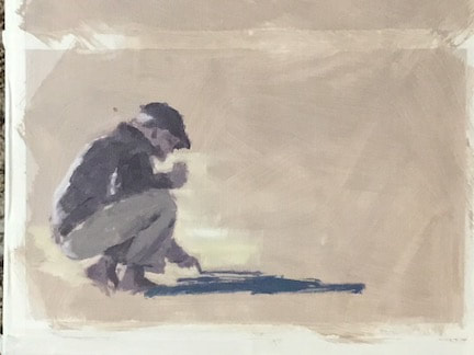 With another figure (photo provided by Marjorie) taken one step further, I added just a couple areas of color, making sure the value was the same as my tonal lay-in. It's a little hard to see here, but the man's cast shadow is a blue hue and there is a slightly lighter mid-tone value of yellow on the sand around his legs. I could continue to add color to his shirt, hat, etc, being very careful to keep the color value the same as the tonal value. That can be difficult because our eyes tend to trick us with color values. This was so much fun to paint in this way that, for the next few days, I used my own photo references to practice what I learned. One side benefit is that it has really helped me with my drawing practice and given me hope that I can grow in that skill, too.
 Thank you for reading my blog! And don't miss the new group of paintings in my fabulous Art Sale!! See them HERE!!
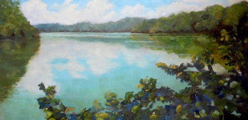
How many jokes and eye rolls can we do to ease the pain of this complicated year? Even good news seems overshadowed by the global trauma of the pandemic and unrest. Are you all readers of history? it seems to me that there is "nothing new under the sun'; people have forever been challenged with politics and economics and disease. Lately I am reading Hilary Mantel's third book about Thomas Cromwell and the disastrous era of King Henry VIII. They were facing unrest on all fronts, opposing points of view, rumors of war, lies and intrigue, not to mention, disease with no antibiotics and minimal comprehension of microbes. And we are still here five hundred years later dealing with similar problems. Something to ponder, eh? Here is a sweet bit of light in this shadowy time: one good art show will go on as planned, with some Covid modifications: 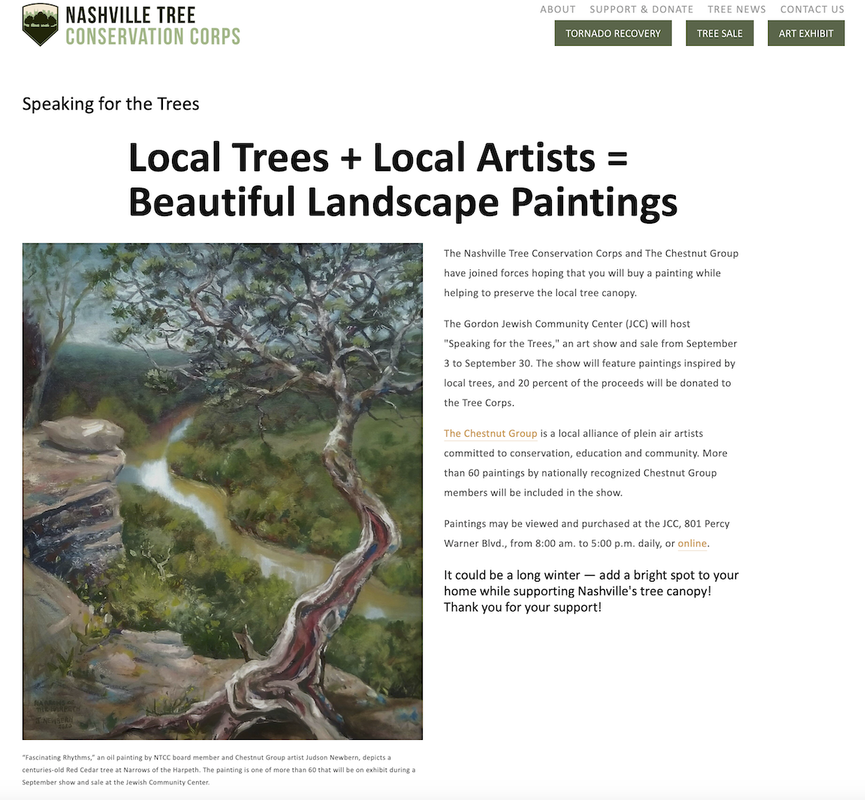 The plein air artist group that I am a member of partners each year with at least one Nashville organization whose goals are to preserve natural and/or historic areas in Middle Tennessee. For the month of September we will have our paintings on display and for sale to benefit the Nashville Tree Conservation Corps and help to further their mission of preserving and protecting the tree canopy in our urban community. Many of the Chestnut Group artists have their amazing work in this show. It can be viewed online (HERE) or by visiting the Gordon Jewish Community Center in Nashville, 8-5 daily. These are my two paintings available in this art show: 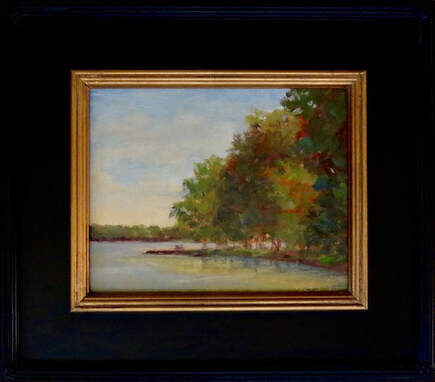 "Water's Edge" 8x10 Oil $300 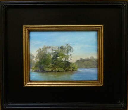 "Heron Rookery" 6x8 Oil $200 Both paintings were done plein air at the lakeside across the street from where I live. It's a pretty popular spot; locally known as "Skinny Dip Cove" (...not sure why...?) These two days I had it to myself and was immersed in the beauty, if not the water. And now I am happy to deliver on my previous blog post promise to offer the next batch of paintings in my Anniversary Sale! Click HERE to view and contact me through the website or my email: wendyervinart@gmail.com if you have questions or wish to purchase. (which I hope you will because they need forever homes and I need more art supplies! haha!)
Thank you for reading my blog!! It's always fun to celebrate and we humans find so many events to rejoice over: birthdays, graduations, weddings, and in this case, my anniversary. This month of July marks the tenth year that I have been painting seriously and intentionally. As many of you know, I had been a pediatric nurse for many years, in hospitals and home health, and was very fulfilled in helping little ones heal and have good starts in life. But a secret desire rumbled around in my heart: to be able to create a scene of some thing or some place that was special, beautiful, and meaningful. I wanted to learn to paint and be an artist. And now I am celebrating my 10 year anniversary of those early months of oil painting lessons. What better way to celebrate than to give a huge discount to all you faithful patrons, readers, appreciators, and friends! Every few weeks I will be offering a few paintings at a time at significantly reduced prices. All the paintings will be $200 or less and no larger than 11x14. They are all original oil paintings from various points in my art journey. if you see one you like, please contact me either through the website contact page or directly at wendyervinart@gmail.com.
I thought it would be fun to show some of my early paintings: And follow it up with some of my more recent ones: What a happy, challenging journey, and still a long way to go! Thanks for your support and for reading my blog!!
 After spending four and a half hours times two traveling to and from Seattle this past weekend, I realized how many things a good book has in common with a good painting. My Kindle had two novels downloaded from the library (if you don't have the Libby App yet, here's some info). I started the first book, expecting to become deeply immersed in a compelling, enjoyable read and, being the fair-minded person that I am, I gave it the entire 4 hour flight time to SeaTac before deciding it wasn't for me. On the trip back to Nashville, I turned to my second downloaded book and, even though it was a much slower start with much more initial information to wade through, I found myself drawn into and captured by the story. So, what are the elements that good writing and good painting have in common? First of all, a really good book must have a solid structure that gives the reader a sense of form that this story will take them. My brother-in-law is an author and has taught me much about his writing process, which begins . Similarly with a painting, the first step is to create a structure that I will call The Composition. While I can't paint the "ending", I can make decisions of lines, shapes, orientation, and placement that create the bones of the painting and will take me where I want it to go. A sloppy composition has competing focal areas, redundant shapes, or uninteresting lines. Similarly, a sloppy story may have meandering threads, competing genres, or tedious dialogue within it. A second element that books and paintings share is Clarity: how clear has the artist (writer or painter) communicated the "reason for the art"? After just a few pages you should have a sense of the author's theme and what she wants this book to teach or show you. Did you know that most people in art museums and galleries will only look at a painting for 15 to 30 seconds? So both writer and painter must be on their game to make clear the reason, main idea, and purpose of their work. A writer will do this through character development, story line, and themes; a painter through subject matter, values (darks and lights), and color use. A painting with highly saturated colors sends a completely different message than the one that is painted with muted, grayed down colors. Many successful paintings have a clear path (often a literal path) into and around the whole painting to keep the viewer engaged and interested in what it is saying. I'm sure there are many other similarities that books and paintings share, but I want to end this short essay with this third element that I can only call the "It Factor". I found this definition: "the It Factor is very elusive as it refers to the hard-to-define quality that makes something special and outstanding." I'm certain that art competition judges can define what it is that makes a painting stand out, but for the rest of us it is more an intuitive resonance as we respond to a painting. And it is highly individual; one person loves impressionism and another prefers realism, etc. Of course, all the other technical elements must be in place, but the artists that charm me often have a style or a signature color or a type of brushstroke that connects with me. In a more universal sense, the It Factor tends to resonate across a large swath of folks...hence: book awards and blue ribbons. These are the artists and writers who rise to the top with best sellers and solo art shows. Here is your take-away from this post: next time you are looking at a painting, linger just a little longer than 30 seconds and see if you can sense the structure, the message, and the thing that brings a thrill. Making art has helped me appreciate good art so much more and I hope that is what reading my blog will do for you! Thank you!! Happy, healthy summer!! Share kindness...  |